Logo design is like naming a baby, except the baby will be judged by millions of people, needs to work in every possible context, and might determine the success of a multi-million dollar business. No pressure, right?
At DesignLion, we’ve created logos for everything from tech startups to local bakeries, and the process never gets easier. Every logo needs to work at massive billboard size and tiny favicon dimensions, look professional on business cards and approachable on Instagram posts, and somehow capture the essence of a brand in a simple mark.
The internet is littered with articles claiming you can design a logo in five minutes using AI or template tools. These articles are written by people who have clearly never tried to explain to a client why their logo looks terrible when embroidered on a polo shirt or why it disappears when printed in black and white.
The Strategic Foundation: Logos Are Not Art Projects
The biggest mistake amateur logo designers make is treating logos like personal art projects. A logo isn’t meant to be beautiful in isolation; it’s meant to be functional in context. It’s the difference between designing a race car and designing a sculpture. Both require skill and creativity, but they serve completely different purposes.
Before touching any design software, we spend time understanding the business, industry, target audience, and competitive landscape. A logo for a cryptocurrency startup needs to communicate innovation and trustworthiness in a crowded, skeptical market. A logo for a family restaurant needs to feel welcoming and established in a community-focused context.
Market research isn’t just for big corporations. Even small businesses benefit from understanding how their audience perceives different visual approaches. We’ve seen logos that the business owner loved but tested poorly with actual customers because they conveyed the wrong message or failed to differentiate from competitors.
The most successful logos solve specific business problems. Nike’s swoosh suggests movement and achievement. Apple’s apple suggests simplicity and approachability in technology. Amazon’s arrow points from A to Z, suggesting comprehensive selection. These aren’t accidents; they’re strategic design decisions that support business objectives.
Simplicity: The Hardest Thing to Achieve
“Simple” doesn’t mean “easy” or “quick.” Achieving elegant simplicity requires removing everything non-essential while maintaining meaning and impact. It’s like writing a haiku instead of a novel. Every element needs to justify its existence.
Simple logos work better across different applications and scales. A complex logo might look impressive on a business card but become illegible when used as a social media profile picture or app icon. We always test logo designs at various sizes, from large format prints down to 16×16 pixel favicons.
The Apple logo evolution demonstrates the power of simplification. The original rainbow apple was colorful and detailed, but the current monochrome version works better across digital applications, printing methods, and cultural contexts. Sometimes less really is more.
Simplicity also aids memorability. People can more easily remember and reproduce simple shapes and concepts. Complex logos might be impressive initially but fade from memory quickly. Think about logos you can draw from memory; they’re probably the simple ones.
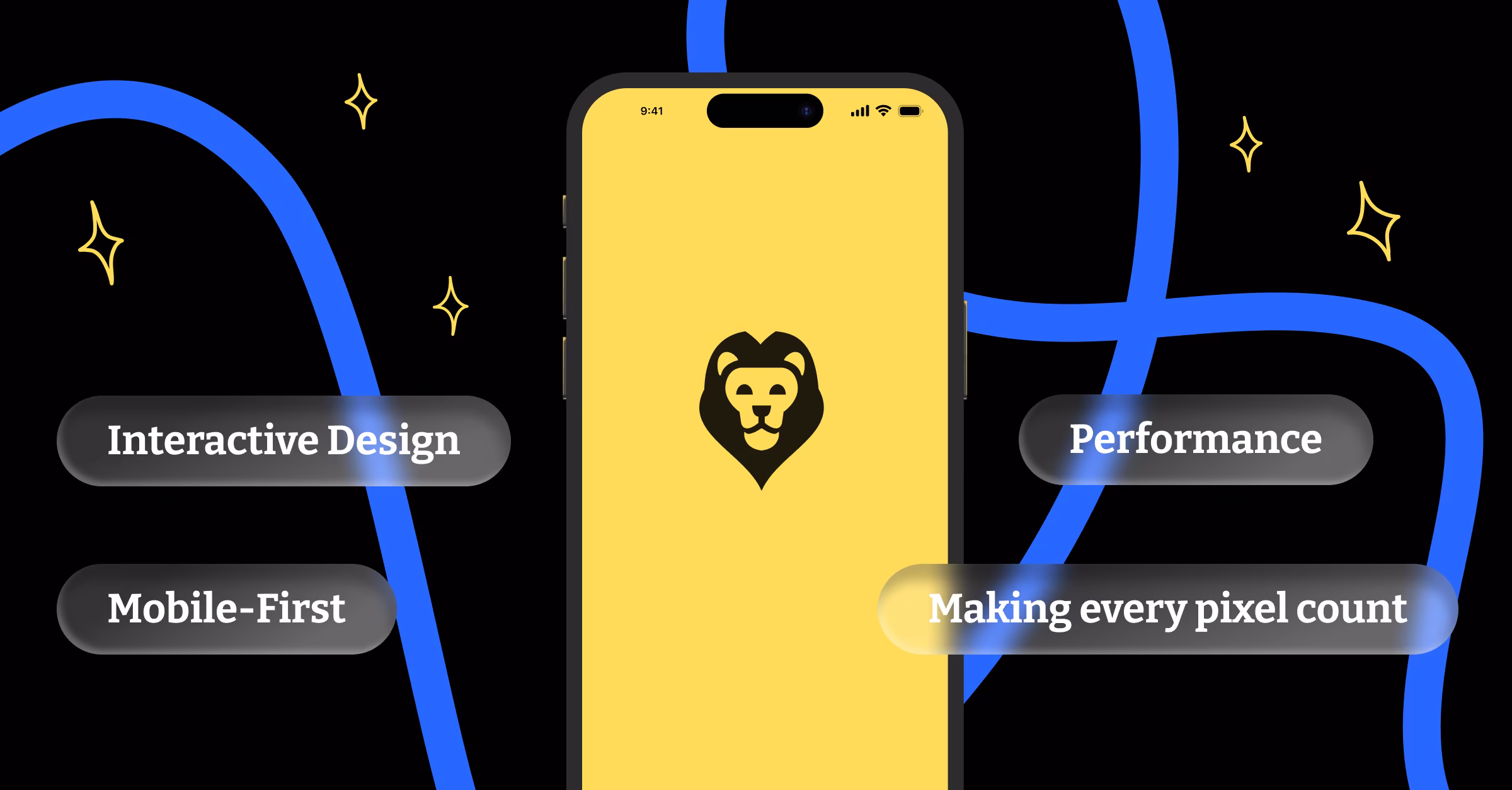
Versatility: Designing for Every Possible Context
Modern logos need to work across more contexts than ever before. Print advertising, digital displays, social media profiles, mobile app icons, embroidered apparel, vehicle wraps, architectural signage, and promotional products all have different requirements and limitations.
We create logo systems rather than single logo designs. This includes primary logos, simplified versions for small applications, horizontal and vertical layouts, and variations for different background colors. A complete logo system anticipates the various ways the logo will be used and provides appropriate options for each context.
Color variations are crucial for practical applications. The logo needs to work in full color, single color, reversed out of backgrounds, and in black and white. If your logo only works in color, you’ll face problems with newspaper ads, fax transmissions, embossing, and budget printing situations.
Scalability testing reveals problems that aren’t apparent when viewing logos at standard sizes. Fine details that look sophisticated at large sizes can disappear or become muddy when scaled down. We always test logos at the smallest size they’ll likely be used, typically favicon dimensions.
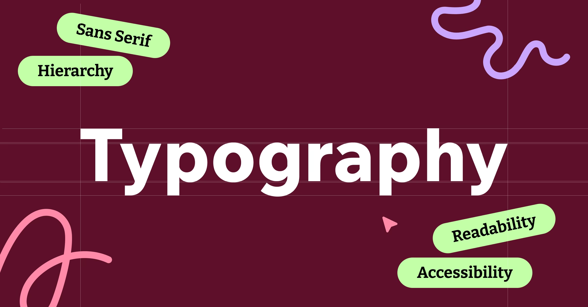
Typography Integration: When Words and Symbols Dance
Many logos combine symbolic elements with typography, creating integrated systems where text and imagery work together harmoniously. The relationship between these elements affects readability, memorability, and overall impact.
Custom typography can create unique brand expressions, but it also introduces complexity and potential problems. Custom letterforms need to maintain readability while expressing brand personality. They also need to work when the text is used without the symbol in certain applications.
Font selection for logos requires different considerations than fonts for body text. Logos often use display fonts that prioritize personality over extended readability. But logo typography still needs to be legible at small sizes and across different reproduction methods.
We often create multiple typography treatments within a logo system. The primary logo might use custom letterforms, while secondary applications use a carefully selected standard font that maintains visual consistency but provides more flexibility for various applications.
Color Psychology in Logo Design
Color choices in logos carry more weight than in most other design applications because logos need to work consistently across years or decades. Color trends come and go, but logos need longevity that transcends temporary aesthetic preferences.
Different industries have established color associations that can either be leveraged or deliberately challenged. Financial services gravitate toward blues and grays for trustworthiness, while food companies often use warm colors to stimulate appetite. Understanding these conventions helps determine when to conform and when to differentiate.
Cultural color associations vary globally, which matters for businesses with international aspirations. A color that represents prosperity in one culture might represent mourning in another. We research color meanings in target markets, especially for brands with global ambitions.
Color accessibility affects logo applications across various contexts. High contrast combinations ensure visibility for users with color vision deficiencies and work better in challenging viewing conditions like bright sunlight or low-light environments.
The Design Process: From Concept to Reality
Our logo design process starts with extensive research and concept development before any visual work begins. Understanding the business, audience, competition, and objectives provides the foundation for effective design decisions.
Sketching and ideation happen on paper before moving to digital tools. Hand sketching allows for rapid exploration of concepts without getting caught up in digital perfection. Many of our best logo concepts start as rough sketches that capture essential ideas before refinement.
We typically develop multiple conceptual directions rather than iterating on a single approach. This allows clients to see different strategic approaches and helps avoid the tunnel vision that can occur when refining only one concept.
Digital refinement involves careful attention to proportions, spacing, and technical execution. Vector graphics ensure scalability, but proper construction also matters for consistency across applications. Anchor points, curves, and proportional relationships need mathematical precision.
Testing and Validation: Reality Checks for Design Decisions
Logo designs need validation beyond the design team and client opinions. User testing with target audience members reveals how the intended message is actually perceived and whether the logo achieves its strategic objectives.
We test logos in realistic contexts, not just as isolated designs on white backgrounds. Seeing how a logo works on actual business cards, websites, signage, and other applications reveals practical problems that aren’t apparent in pristine design presentations.
Focus groups can provide valuable feedback, but they need careful management to avoid design-by-committee problems. We focus testing on strategic questions about message communication and brand perception rather than aesthetic preferences.
A/B testing for digital applications can provide quantitative data about logo performance. Different logo treatments can be tested for recognition, click-through rates, and user engagement to determine which approaches work best in practice.
Legal Considerations: Protecting Creative Work
Trademark research ensures that new logos don’t infringe on existing registered marks. This research needs to consider not just identical matches but also designs that might be considered “confusingly similar” by trademark standards.
We work with trademark attorneys for clients who want to protect their logos legally. The trademark registration process provides legal protection but also requires ongoing maintenance and enforcement to remain effective.
Copyright protection automatically applies to original logo designs, but registration provides additional legal benefits. Understanding the difference between copyright and trademark protection helps clients make informed decisions about protecting their brand assets.
International considerations matter for businesses with global aspirations. Trademark protection varies by country, and designs that are available in one market might be protected in others. Early international research can prevent costly problems later.
The Business Impact: Measuring Logo Success
Logo effectiveness can be measured through various metrics including brand recognition, recall rates, and business performance indicators. While logos alone don’t determine business success, they contribute to overall brand perception and market performance.
Brand recognition studies show how well target audiences can identify and remember new logos. These studies help optimize logo designs for maximum memorability and differentiation from competitors.
Business metrics like website traffic, conversion rates, and customer acquisition can be affected by logo changes, especially for digital-first businesses where logos are prominent in user interfaces and marketing materials.
Long-term brand value accumulates over time as logos become associated with positive experiences and outcomes. Consistent logo usage across touchpoints helps build this association and increases overall brand equity.
Great logos become invisible assets that work continuously to build brand recognition and convey strategic messages. They’re not decorative elements but functional tools that support business objectives through visual communication. The best logos make their businesses more memorable, trustworthy, and successful without calling attention to themselves as design objects. They just work, consistently and effectively, across every context where they appear.