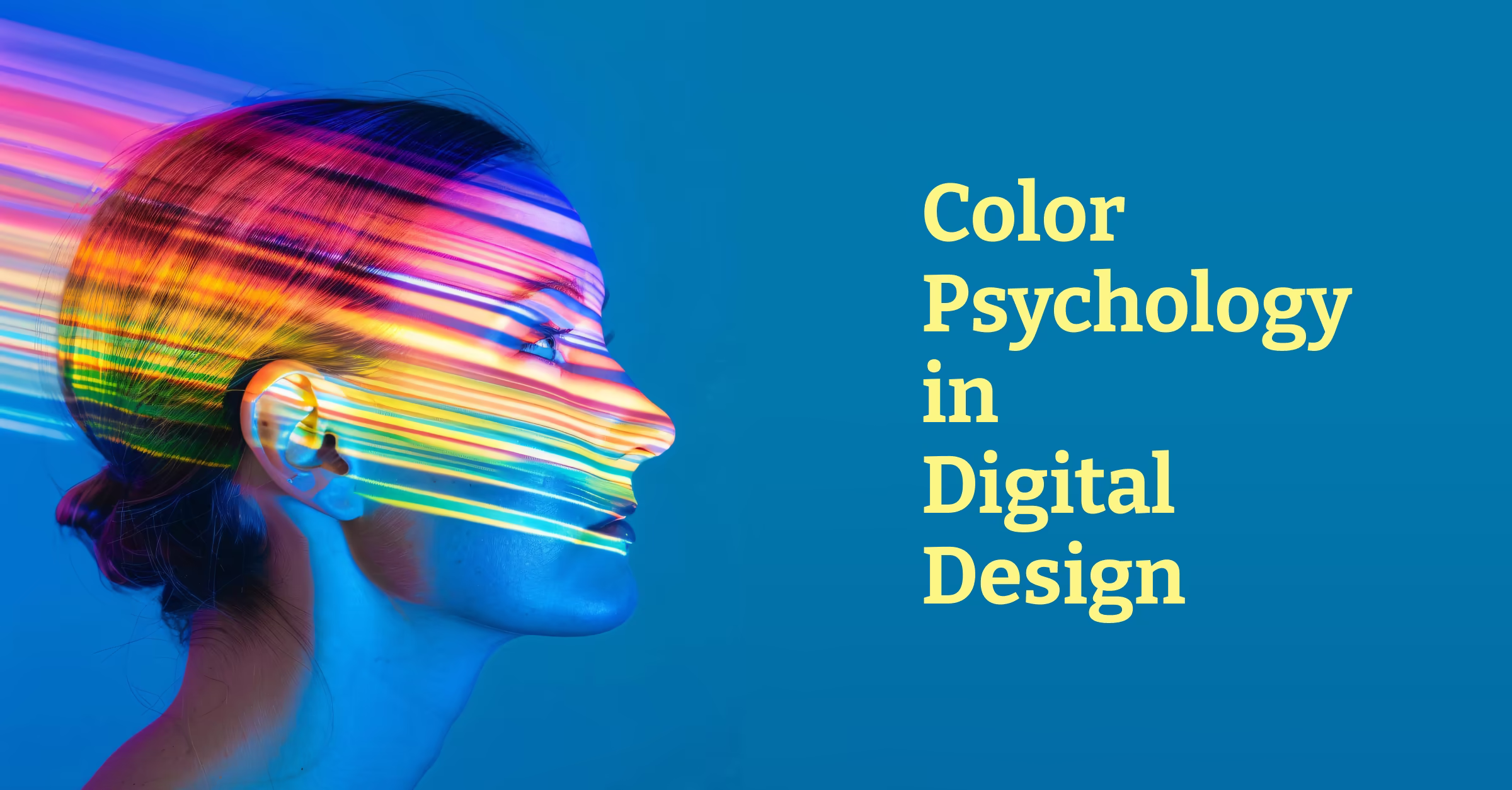
Color psychology in digital design is like that friend who claims they can read people’s personalities based on their coffee order. Sometimes they’re surprisingly accurate, and sometimes they’re completely off base, but it’s always interesting to listen to.
After designing hundreds of websites, logos, and apps at DesignLion, I’ve learned that color choices can make or break a digital experience faster than you can say “Comic Sans.” But here’s the thing that most designers get wrong: color psychology isn’t about universal truths. It’s about context, culture, and the specific relationship between your brand and your audience.
The Science Behind Color Perception
Before we dive into the touchy-feely aspects of color psychology, let’s talk about the hard science. Color perception happens in your brain, not in your eyes. Your eyes are just the messengers, like that friend who always has the latest gossip but sometimes gets the details wrong.
Different wavelengths of light trigger different responses in our visual system, but the interpretation of those signals is influenced by everything from our evolutionary history to what we had for breakfast. This is why designing with color requires understanding both the biological and psychological aspects of human perception.
Research in neuroscience shows that color processing happens in multiple areas of the brain simultaneously. The visual cortex handles the basic perception, while areas associated with emotion and memory add layers of meaning and association. It’s like having a committee in your head that debates every color choice, except the committee members all have different priorities and never fully agree.
Cultural Context: Why Red Doesn’t Always Mean Stop
Here’s where things get culturally complicated. In Western cultures, white is associated with purity and weddings. In many Eastern cultures, white represents mourning and death. Design a wedding website with a primarily white color scheme for a global audience, and you might accidentally create something that feels more like a funeral announcement.
Red is probably the most culturally variable color in terms of meaning. In China, red symbolizes luck and prosperity. In South Africa, it’s associated with mourning. In Western financial applications, red typically indicates loss or negative values. Context isn’t just king in color psychology; it’s the entire royal family.
We learned this lesson when designing an e-commerce platform for a client with an international customer base. Our initial color scheme used red for sale prices, assuming it would create urgency and excitement. User testing revealed that customers in certain regions associated the red pricing with warnings or errors, actually reducing conversion rates.
The Emotional Spectrum: How Colors Make Users Feel
Blue is the overachiever of the color world. It’s trusted by everyone from banks to social media platforms because it conveys reliability, trust, and professionalism. But use too much blue, and your design starts feeling colder than a corporate office in January.
Green has become synonymous with “go,” “success,” and environmental consciousness. It’s why so many fintech apps use green for positive account balances and why almost every environmental organization’s logo features some shade of green. But different shades of green can evoke completely different responses. Bright lime green feels energetic and youthful, while deep forest green feels stable and natural.
Yellow is the attention-seeking child of the color family. It’s bright, optimistic, and impossible to ignore. But it’s also the most fatiguing color for the human eye to process. Use yellow as an accent color for important calls-to-action, and you’ll grab attention. Use it as a background color, and your users will need sunglasses to navigate your interface.
Industry-Specific Color Expectations
Every industry has developed its own color language over time. Healthcare websites are dominated by blues and greens because these colors feel clean, trustworthy, and calming. Financial services gravitate toward blues and grays for similar reasons, with the occasional gold accent to suggest prosperity.
Tech companies have been living in a world of blues, grays, and whites for so long that any deviation feels revolutionary. When we designed a SaaS dashboard using warmer colors like oranges and deep reds, the client was initially nervous. But user feedback showed that the warmer palette made the complex software feel more approachable and less intimidating.
Food and restaurant brands play by completely different rules. Warm colors like reds, oranges, and yellows are proven to stimulate appetite. Fast-food chains have been using this psychological trigger for decades. McDonald’s golden arches and red branding aren’t accidents; they’re designed to make you hungry and create a sense of urgency.
Color Accessibility: Making Choices That Include Everyone
Color accessibility goes far beyond just considering colorblind users, although that’s certainly important. It’s about understanding that color perception varies widely among individuals and ensuring that your color choices don’t exclude anyone from accessing your content.
Colorblindness affects approximately 8% of men and 0.5% of women, but there are many different types of color vision deficiencies. The most common form, red-green colorblindness, doesn’t mean people can’t see red and green at all. It means they have difficulty distinguishing between certain shades of these colors.
We always test our color schemes using colorblindness simulation tools, but we also follow the principle of never using color alone to convey important information. If red text indicates an error, we also include an icon and descriptive text. If green indicates success, we provide additional visual or textual confirmation.
The Technical Side: Color in Different Digital Contexts
RGB colors on screens behave differently than CMYK colors in print, and both behave differently than the colors you see in real life. Understanding these differences is crucial for maintaining color consistency across different touchpoints in a user’s journey.
Monitor calibration affects how colors appear to end users. That carefully chosen shade of blue might look perfect on your calibrated design monitor but appear purple on your user’s cheap laptop screen. We always test our designs on various devices and in different lighting conditions to ensure color consistency.
Dark mode has added another layer of complexity to color choice in digital design. Colors that work beautifully on light backgrounds can become illegible or lose their emotional impact on dark backgrounds. Designing for both light and dark modes requires thinking about color relationships rather than absolute color values.
Color Trends: Following vs. Leading
Color trends in digital design move faster than fashion trends, but they’re just as cyclical. The flat design era brought us minimal color palettes with bright accent colors. The current era seems to embrace more complex gradients and duotone effects.
Following trends can make your design feel current and relevant, but it can also make it indistinguishable from everything else. The key is understanding why certain color trends emerge and whether they serve your specific design goals.
We’ve found that brands with strong color identities often transcend trends. Think about Coca-Cola’s red or Tiffany’s blue. These colors have become so associated with the brands that they’ve essentially trademarked them in consumers’ minds.
Building a Color System That Scales
Creating a color palette for a single webpage is relatively straightforward. Creating a color system that works across websites, mobile apps, marketing materials, and physical spaces is like conducting a symphony orchestra while riding a unicycle.
A good color system includes primary brand colors, secondary supporting colors, neutral colors for backgrounds and text, and functional colors for things like errors, warnings, and success states. Each of these colors needs to work harmoniously together and maintain accessibility standards across all combinations.
We use tools like Adobe Color and Coolors to generate harmonious color palettes, but the real work happens in testing these colors in actual design contexts. A color that looks perfect in isolation might clash horribly when placed next to your primary brand color.
The Psychology of Color Combinations
Individual colors have psychological associations, but color combinations create entirely new psychological responses. High contrast combinations like black and white create a sense of sophistication and clarity. Analogous color combinations feel harmonious and natural. Complementary colors create energy and tension.
The 60-30-10 rule provides a good starting point for color distribution in digital interfaces. 60% of your interface should use a dominant neutral color, 30% should use a secondary color, and 10% should use an accent color for important elements. This creates visual hierarchy while maintaining balance.
Measuring the Impact of Color Choices
Color choices in digital design aren’t just aesthetic decisions; they’re business decisions that can be measured and optimized. A/B testing different color schemes for call-to-action buttons, backgrounds, and key interface elements can provide concrete data about how color affects user behavior.
Conversion rates, time on site, task completion rates, and user satisfaction scores can all be influenced by color choices. We’ve seen conversion rates increase by over 20% simply by changing the color of a primary button from blue to orange, but we’ve also seen the opposite happen when the color change didn’t align with user expectations or brand identity.
The key to successful color psychology in digital design is remembering that there are no universal rules, only principles that need to be applied thoughtfully within specific contexts. Your users, your brand, your industry, and your goals all influence how color psychology should guide your design decisions. The best color choices are the ones that serve your users while supporting your business objectives, even if they don’t follow the latest trends or conventional wisdom.