Summary
Discover how we used metrics, insights and usability testing to add over $1M ARR for Medly, a well known EHR
We have redesigned Medly. It is an Electronic Health Record (EHR).
Our role was to completely redefine the experience, from an obsolete UI written by the devs without any design guidance.
The results after the first year:
24% increase in annual recurring revenue
21% increase in average revenue per user
15% increase in new signups
17% decrease in churn
We will cover:
- Introduction
- Objectives
- Research goals and methods
- The problems
- The audience
- Brainstorming
- Our process: from sketches to launch
- The solution
- Testing and iteration after launch
- Conclusion
1. Introduction
Medly’s main role is to connect alternative medicine practitioners that offers services like acupuncture, chiropractic, massage, physical therapy, cupping and yoga with their patients through a patient portal.
This platform can manage appointments, billing, charting, reports and medical insurance.
The core features of this product were too slow and too complicated.
It needed a redesign.
2. Objectives
Business objectives
- Reduce churn by 5%
- Lower starter membership plan subscriptions from 58% to 40%
- Increase ARPU(Average revenue per user) by 22%
- Increase ARR(Annual recurring revenue) by 12%
Our objectives
- Provide the best onboarding experience
- Create a customizable charting experience and get users fast to value
- Improve billing feature
- Provide useful reports with the help of AI
- Bring a consistent experience across devices
3. Research goals and methods
Our plan was first to understand user needs.
How?
- Identify pain points
- Hold one-on-one interviews with all personas
- Conduct surveys
- Do competitive analysis
- Analytics review
User needs
- Have a clear onboarding process
- Spend less time searching for patient history
- Ability to invoice normally and through superbills
- Ability to easily make chart amendments
- Ability to create and sign an intake as fast as possible
- Same experience across laptops, tablets and smartphones
4. The problems
We have started by taking a look at how much time does a practitioner spends on any given appointment.
We found interesting problems:
Patient arrives: preparing for a new intake took 2 min 46 sec
→Now that’s a lot. Imagine that the patient needs to stay in front of the practitioner all this time. This was a major pain point.
Patient leaves: invoicing took 1 min 33 sec
→ This was like a test of patience for both parties.
Lost time: 4 min 19 sec per appointment. HUGE.
On top of this, we have identified the following problems:
- Confusing onboarding process that triggered 9% of clients to ask for a refund
- Low user engagement on core features like charting, billing and calendar
- Charting had only one template that couldn’t be modified
- Practitioners modified charts without keeping a log, a bad industry practice
- Financial situation was unclear for clinic owners, due to bad reporting tools
- Inconsistent experience due to different layout for each device
5. The audience
Our target audience:
- Single practitioners
- Clinic administrators
- Students
- Teachers
- Patients
- Front desk operators
6. Brainstorming
We’ve collaborated with the stakeholders, the CEO, product managers and support team members.
For insights research, we used ProductBoard and Pendo.
We’ve started with doing a couple of crazy 8s sessions.
For the long run, we used mind mapping and sketches.
Below, you will find our first sketch:
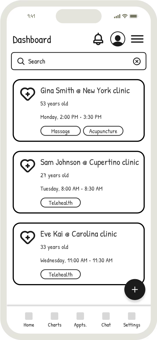
Our initial dashboard sketch
What we initially thought our users want
7. Our process: from sketches to launch
The process took 6 months.
Our team did the following:
- Researched competitors
- Aligned business objectives with the stakeholders
- Studied all the insights to identify user pain points
After we have noted all the pain points, we have began to draw the first sketches.
Based on those, the first Figma prototype was born.
It was far from perfect, but still better than the actual experience.
The first wave of usability testing was done with 5 people from each persona.
We’ve noted all the feedback points and prioritized each item.
After the issues were fixed according to their priority, we’ve tested again with another 5 different people from each persona.
Patterns started to emerge.
We had enough information. Time to go bigger.
Our prototype was ready for a bigger usability testing waves now, especially after fixing all the mistakes from prior iterations.
For this, we have used Maze and we have defined missions for our users.
We believe in functional and beautiful experiences.
Our simplified process 👇
1. Initial sketch
Our hypothesis
2. Validated prototype
What users want
3. Final design
Launch and improve
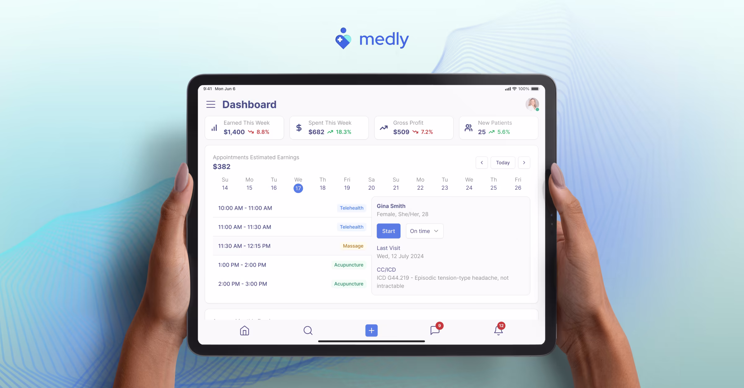
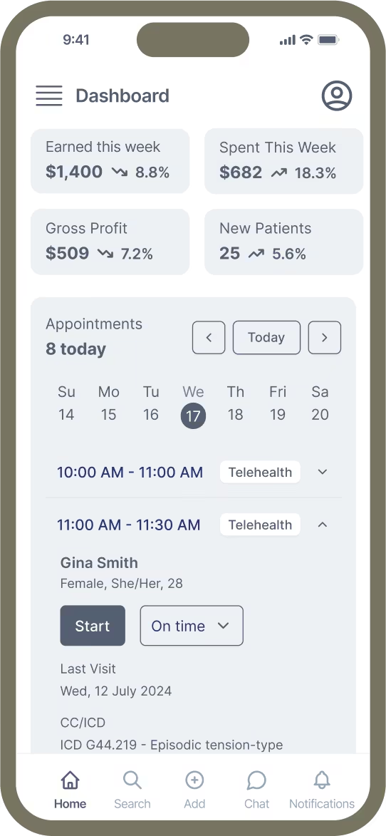
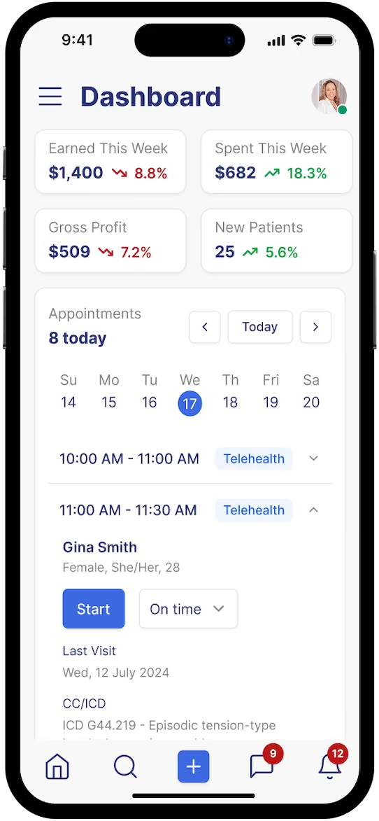
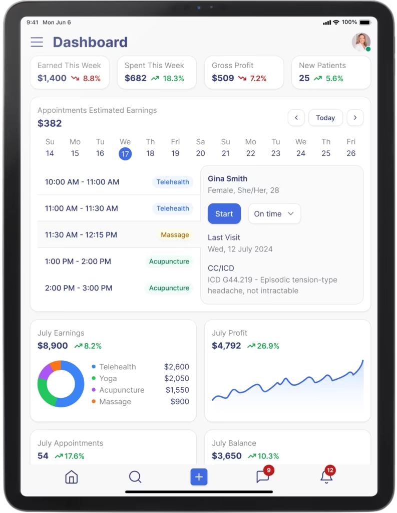
8. The solution
First results after fully launching the redesign:
Patient arrives: preparing for a new intake took 39 sec
→ When an intake started, we have shown that patient’s history, alongside treatments, medical devices and allergies.
Patient leaves: invoicing took 12 sec
→ After the appointment was finished, we have added in the flow the “Create invoice and pay” button. This automatically created invoices or superbills and the patient was charged right away using his already saved payment information.
Before our redesign, the duration was 4 min 19 sec per appointment.
After our redesign, the duration was 51 sec. That’s a BIG win.
Our experience led us to the following solutions:
- Created new onboarding flows for each persona using progressive disclosure, clear labels and intuitive guides.
- Boosted engagement through a new flexible charting experience
- Added patient recap at the start of each intake
- Redefined the billing module and added the option to bill a patient directly from the appointment details.
- Added flexible scheduling and redesigned the appointment details view
- Implemented new financial reports with important insights such as “most profitable area” or “most profitable service”
- Provided the same experience across all devices.
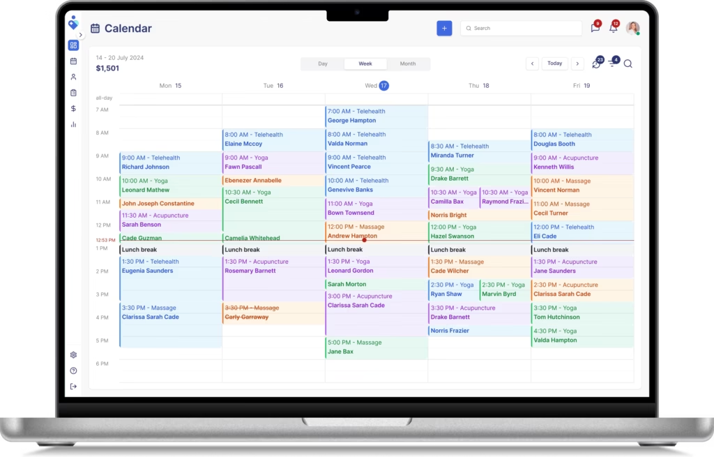
Desktop
This is the most used device by frontdesk managers and clinic administrators. It sole purpose is to create appointments, manage employees and practitioners, manage financial reports and provide support to patients.
Tablet
We really had to nail the experience on this device. Speed was crucial.
Practitioners were taking their tablets from one room to another.
All this time they were taking notes, generating treatments, taking pictures and drawing over them, invoicing the patients.
As you can already tell, it is hard for practitioners to handle this fast pace.
Our design helped practitioners manage sessions 4 times faster than before.
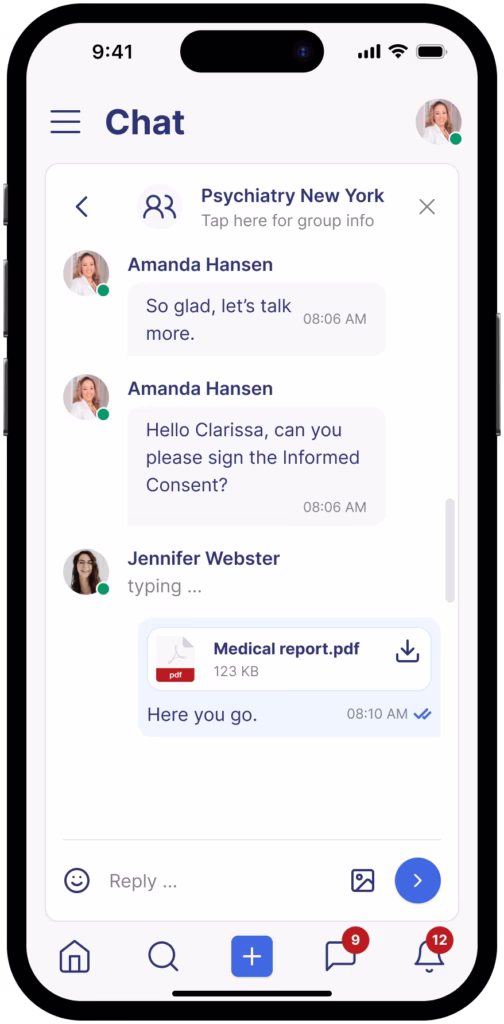
The most important feature for this device in portrait orientation was the ability to chat with patients and send them the medical reports, alongside treatment plans.
Our design helped practitioners communicate with patients 54% faster.
Smartphone
This is where practitioners plan their day, before arriving at the clinic. They accept and schedule appointments, chat with their patients and analyze their financials.
After our redesign, no-shows dropped by 35%.
9. Testing and iteration after launch
We have continued to test for each persona after launch using A/B testing and by analyzing the feedback that provided by our users in ProductBoard.
By using this method, we have launched several improvements:
- New chat system
- Reminders for appointments
- Ability to amend charts and keep their history
- Ability to take a picture and draw over it during an intake
- Added onboarding forms for all patients
Features added after the launch
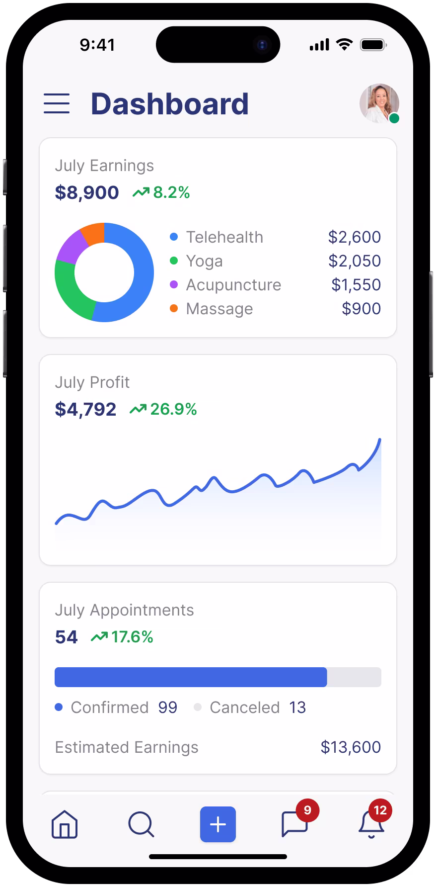
Financial widgets
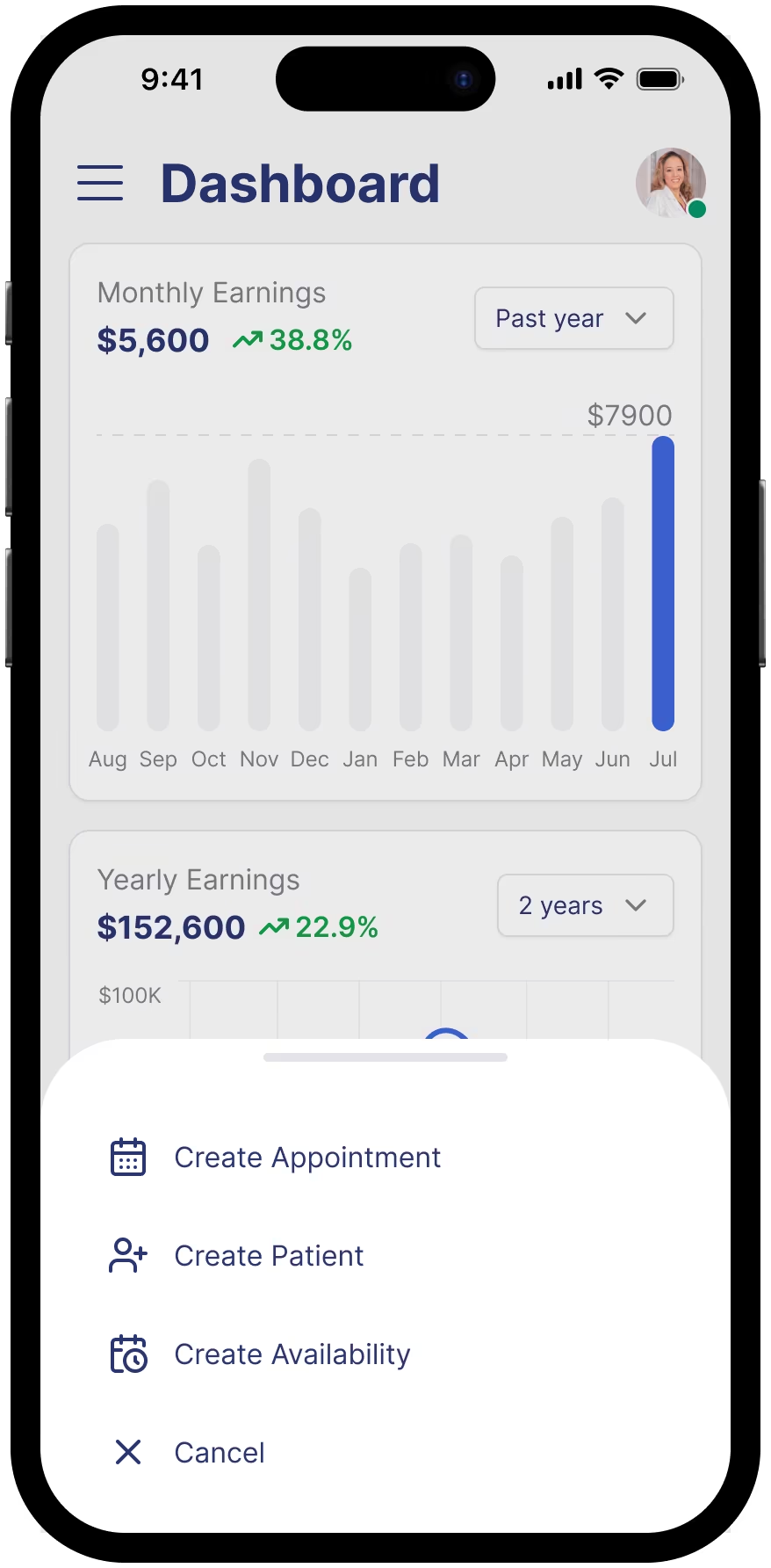
Smart shortcuts
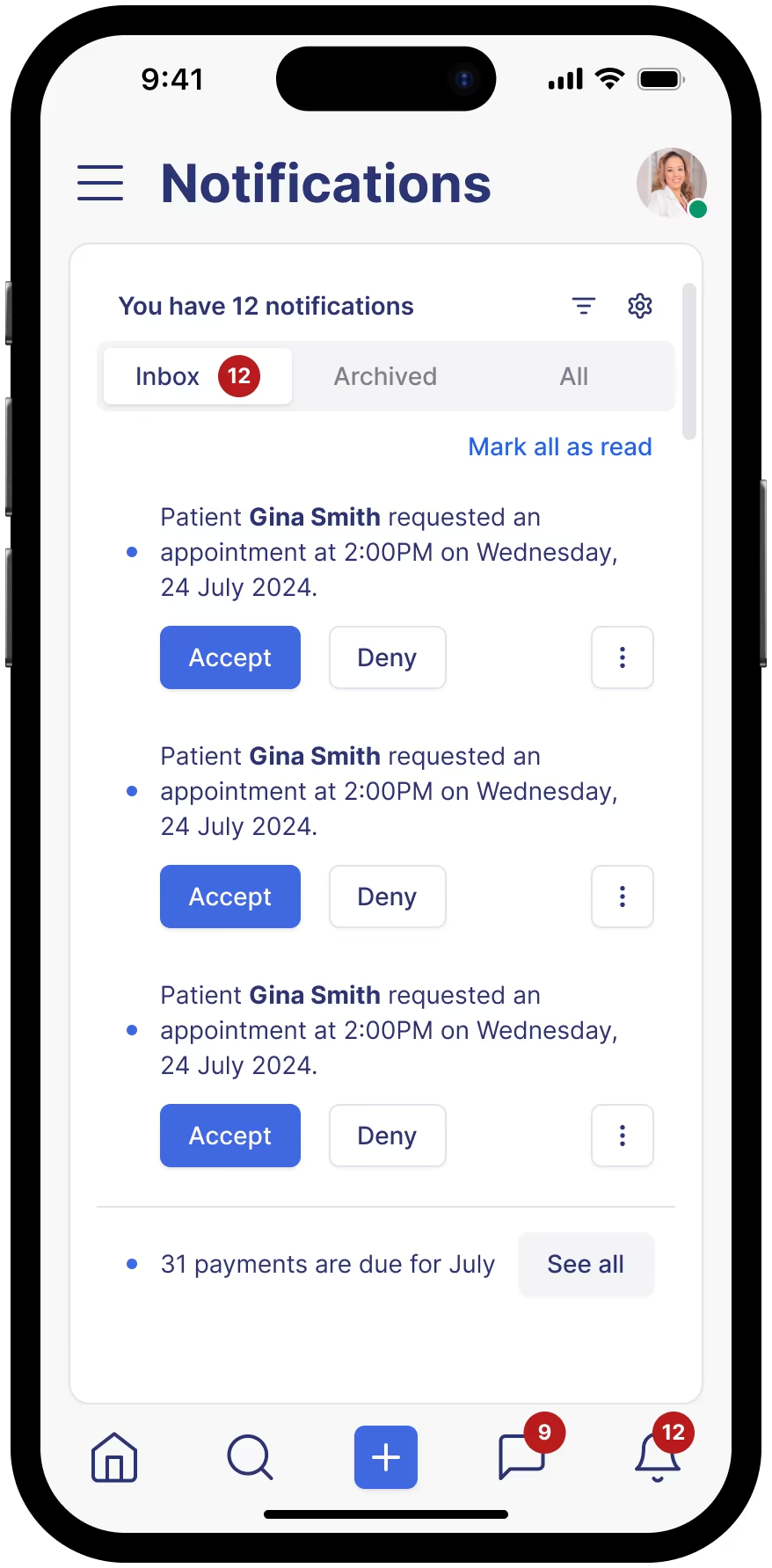
Improved notifications
10. Conclusion
Our work pleased the stakeholders and amazed the users. The impact was massive.
All metrics went up.
The results after the first year:
24% increase in annual recurring revenue
21% increase in average revenue per user
15% increase in new signups
17% decrease in churn
We are results-driven and out strategy paid off yet again.
The feedback that we got after presenting the final version of the UX was astonishing. People asked when this will get implemented.
We supervised the process of implementing our vision into code.
It was a blast working with Medly.