You know that feeling when you see a design that just clicks? Everything feels right, nothing seems out of place, and you can’t quite put your finger on why it works so well. That’s the magic of solid design fundamentals at work.
After spending years building DesignLion and working with hundreds of clients, I’ve learned that the difference between a design that converts and one that confuses isn’t some mystical creative genius. It’s mastering the fundamentals. And here’s the thing: these principles aren’t rocket science, but they’re criminally underrated.
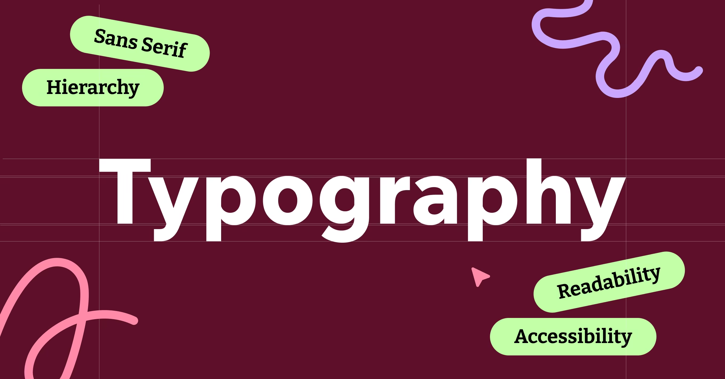
Typography: Your Silent Salesperson
Let’s start with typography because, let’s face it, most of your design is going to be text. Typography is like the voice of your brand. You wouldn’t hire someone with a squeaky voice to be your spokesperson, so why would you choose Comic Sans for your law firm?
The hierarchy principle is your best friend here. Your headline should be the loudest person in the room, your subheadings should be the reliable middle management, and your body text should be the steady worker who gets things done without making a fuss. When someone lands on your website, their eyes should follow a clear path from the most important information to the supporting details.
Here’s a pro tip from our agency work: stick to two fonts maximum. One for headings, one for body text. Any more than that and your design starts looking like a ransom note. We’ve seen too many beautiful websites ruined by font overload.
Color Theory: Psychology in Pixels
Color isn’t just about making things look pretty. It’s about communication, emotion, and yes, conversion rates. Every color choice you make is sending a message, whether you realize it or not.
The 60-30-10 rule has saved us countless times when working on branding projects. Your dominant color takes up 60% of the space, your secondary color gets 30%, and your accent color gets 10%. This creates visual balance and prevents your design from looking like a rainbow exploded.
But here’s where it gets interesting: cultural context matters more than you think. Red means danger in Western cultures, but it’s the color of luck and prosperity in China. We learned this the hard way when designing for a client’s international market. Always research your audience’s cultural associations with color.
Balance and Composition: The Invisible Force
Balance in design is like salt in cooking. When it’s right, you don’t notice it. When it’s wrong, it ruins everything. We’re talking about visual weight here, not just physical symmetry.
Asymmetrical balance often works better than perfect symmetry because it feels more natural and dynamic. Think about how your eye moves around a well-designed magazine layout. There’s movement, there’s rest, there’s emphasis, and there’s breathing room.
The rule of thirds isn’t just for photographers. Divide your design space into a 3×3 grid and place important elements along those lines or at their intersections. It creates more engaging compositions than centering everything.
White Space: The Unsung Hero
White space, or negative space, is not wasted space. It’s the pause between notes that makes music beautiful. It’s what makes luxury brands look luxurious and minimalist designs feel sophisticated.
In our website design projects, we’ve seen conversion rates improve dramatically just by adding more breathing room around call-to-action buttons. White space guides attention, reduces cognitive load, and makes content more digestible.
Think of white space as your design’s personal trainer. It keeps everything lean, focused, and performing at its best.
Contrast: Making Things Pop (Literally)
Contrast is what makes your grandmother able to read your website without squinting. But it’s also what makes your design interesting, accessible, and effective.
We’re not just talking about black text on white backgrounds. Contrast happens through size, color, texture, and positioning. A small element next to a large one creates contrast. A rough texture next to a smooth one creates contrast. A curved line next to a straight one creates contrast.
The key is intentional contrast. Every contrast decision should serve a purpose, whether it’s improving readability, creating hierarchy, or drawing attention to important elements.
Alignment: The OCD Designer’s Best Friend
Everything in your design should align with something else. Random placement is the enemy of professional-looking design. This doesn’t mean everything needs to be perfectly centered, but it means there should be invisible guidelines connecting your elements.
Grid systems are your friend here. They provide structure and consistency across your entire design system. Whether you’re designing a business card or a mobile app, a good grid will keep things organized and professional.
Scale and Proportion: Size Matters
Scale relationships in design are like relationships in life. When they’re healthy and balanced, everything works harmoniously. When they’re off, everything feels uncomfortable.
The golden ratio (1:1.618) appears everywhere in nature and has been used in art and architecture for centuries. While you don’t need to calculate it for every design decision, understanding proportional relationships will improve your design intuition.
Practical Application: Putting It All Together
Here’s how we apply these fundamentals in real client work:
When designing a logo, we start with typography and make sure it’s readable at business card size and billboard size. We choose colors based on the brand’s personality and target audience. We use white space to create a memorable mark that doesn’t feel cluttered.
For websites, we establish a clear typographic hierarchy before adding any visual elements. We use color strategically to guide users through the conversion funnel. We leverage white space to reduce bounce rates and improve user experience.
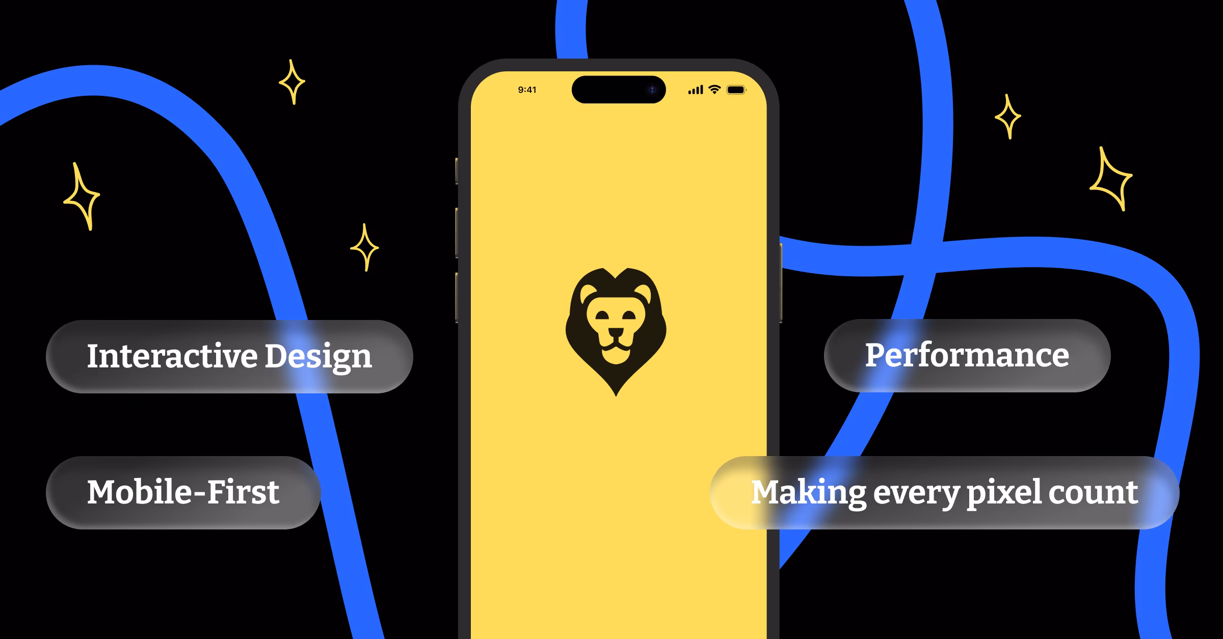
For mobile apps, we prioritize contrast for accessibility and use consistent alignment to create intuitive navigation patterns. Every element earns its place through clear hierarchy and purposeful contrast.
The DesignLion Difference
What sets professional design apart from amateur attempts isn’t access to fancy software or expensive stock photos. It’s the disciplined application of these fundamental principles. Every successful project in our portfolio succeeds because we never skip the fundamentals.
Good design isn’t about following trends or copying what looks cool on Dribbble. It’s about understanding human psychology, respecting cognitive limitations, and creating solutions that work for real people in real situations.
These fundamentals aren’t limitations on your creativity. They’re the foundation that makes true creativity possible. Master them, and you’ll have the tools to create designs that don’t just look good, but actually work.
Remember, great design is invisible. When users can accomplish their goals without thinking about your design choices, you’ve succeeded. When they notice your brilliant gradient or clever animation instead of completing their task, you’ve failed.
Start with the fundamentals. Build on solid ground. Everything else is just decoration.