Remember when mobile-first design sounded like tech industry buzzword bingo? Those days are deader than the floppy disk. Mobile internet usage surpassed desktop usage back in 2016, and it’s been growing ever since. Yet somehow, I still encounter designers and businesses who treat mobile design like that relative you only see at holidays. Polite acknowledgment, but not much real attention.
At DesignLion, we’ve been mobile-first since before it was cool, mainly because our clients kept asking why their websites looked terrible on phones. Turns out, designing for the smallest screen first and then scaling up creates better experiences across all devices. It’s like learning to cook in a tiny apartment kitchen. Once you master that, a full-sized kitchen feels like luxury.
The Numbers Don’t Lie: Mobile is King
Global mobile traffic now accounts for over 60% of all web traffic. In some regions and demographics, that number jumps to over 80%. If your website isn’t optimized for mobile, you’re essentially turning away the majority of your potential audience. It’s like opening a restaurant but only serving people who are exactly six feet tall.
But here’s what’s really interesting: mobile users behave differently than desktop users. They’re more task-oriented, have shorter attention spans, and are often multitasking or dealing with distractions. They might be walking down the street, sitting in a waiting room, or trying to quickly look something up during a conversation. Designing for mobile means designing for these real-world contexts.
Mobile users also have different expectations for speed and simplicity. A page that takes five seconds to load on desktop might be acceptable. On mobile, anything over three seconds feels like an eternity. This isn’t just about impatience; it’s about data costs, battery life, and often slower network connections.
The Technical Foundation: Starting Small and Growing Up
Mobile-first design starts with progressive enhancement rather than graceful degradation. Instead of building a full desktop experience and then trying to cram it into a mobile screen, you start with the core functionality and content for mobile, then enhance it for larger screens.
This approach forces you to prioritize ruthlessly. When you only have 375 pixels of width to work with, every element needs to justify its existence. It’s like packing for a weekend trip with only a carry-on bag. You quickly learn the difference between what you want and what you actually need.
The technical implementation involves using CSS media queries to add complexity as screen size increases. Base styles handle the mobile experience, then media queries progressively add layout complexity, additional content, and enhanced interactions for tablets and desktops.
Content Strategy: Less is More, But Make it Count
Mobile-first design demands a content-first approach. You can’t rely on elaborate layouts or decorative elements to carry your message when screen real estate is limited. Every word needs to work harder, every image needs to serve a clear purpose, and every interaction needs to feel essential.
We’ve found that content written for mobile often works better on desktop too. Concise, scannable content that gets to the point quickly serves users well regardless of their device. It’s like learning to write haikus. The constraint forces you to be more precise and impactful with your language.
Navigation becomes particularly challenging on mobile. Desktop navigation can spread horizontally across the top of a page, but mobile navigation needs to be more creative. Hamburger menus, bottom navigation bars, and progressive disclosure techniques help organize complex information hierarchies into mobile-friendly formats.
Touch Targets and Finger-Friendly Design
Designing for fingers instead of mouse cursors changes everything about interface design. Apple recommends minimum touch targets of 44×44 pixels, but we often go larger, especially for primary actions. A button that feels perfectly sized on desktop can be nearly impossible to tap accurately on mobile.
Spacing between interactive elements becomes crucial. On desktop, you can place buttons close together because mouse cursors are precise. On mobile, cramped interfaces lead to frustrated users accidentally tapping the wrong things. It’s like the difference between picking up objects with tweezers versus wearing boxing gloves.
The thumb zone concept recognizes that most mobile users hold their phones in one hand and navigate primarily with their thumb. Elements in the bottom third of the screen are easiest to reach, while the top corners require awkward hand adjustments. Important actions should live in the thumb-friendly zone whenever possible.
Performance: Speed as a Feature
Mobile performance isn’t just about making things load faster; it’s about respecting your users’ data plans, battery life, and patience. A desktop user might tolerate a heavy webpage because they’re on unlimited broadband and plugged into the wall. A mobile user on a limited data plan will abandon a slow-loading page faster than you can say “loading spinner.”
Image optimization becomes critical for mobile performance. High-resolution images that look crisp on desktop retina displays can be bandwidth killers on mobile networks. Responsive images, proper compression, and modern formats like WebP can dramatically reduce load times without sacrificing visual quality.
Progressive loading techniques help mobile pages feel fast even when they’re not. Loading critical above-the-fold content first, then progressively loading additional content as users scroll, creates the perception of speed even on slower connections.
Forms: The Mobile User’s Nightmare
Forms are where mobile design separates the amateurs from the professionals. A form that’s merely annoying on desktop can be completely unusable on mobile. Small input fields, tiny labels, and unclear error messages turn form completion into an exercise in frustration.
Mobile-optimized forms use larger input fields, clear labels, and input types that trigger appropriate mobile keyboards. Asking for a phone number? Use the telephone input type to bring up the numeric keypad. Need an email address? The email input type adds the @ symbol to the keyboard.
Single-column layouts work better for mobile forms than the multi-column layouts that might work on desktop. Users can focus on one field at a time without having to pan around the screen to see all the required information.
We’ve also learned to minimize required fields ruthlessly on mobile forms. Every additional field is another opportunity for users to abandon the process. If you don’t absolutely need that information to complete the transaction, consider making it optional or collecting it later.
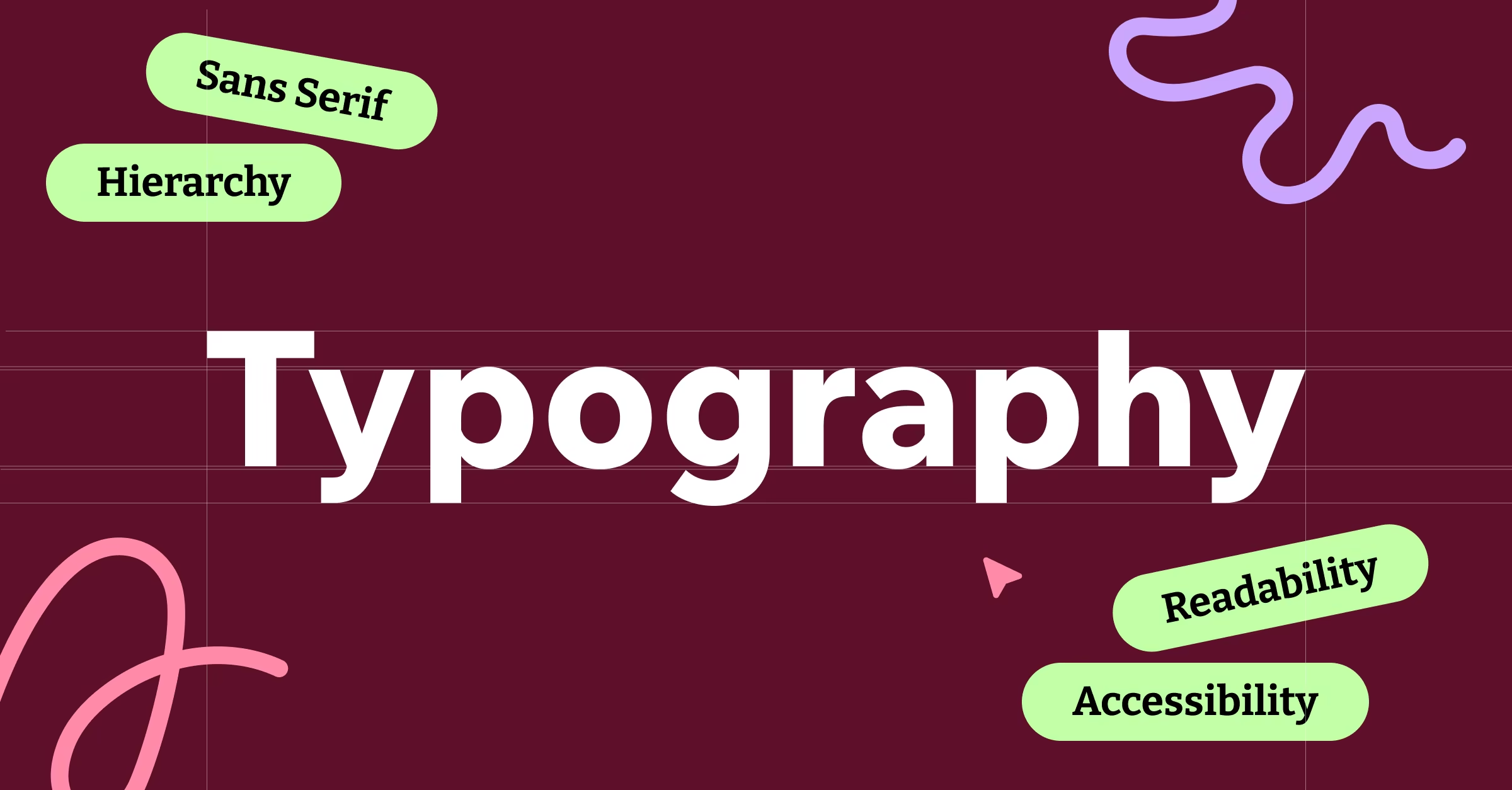
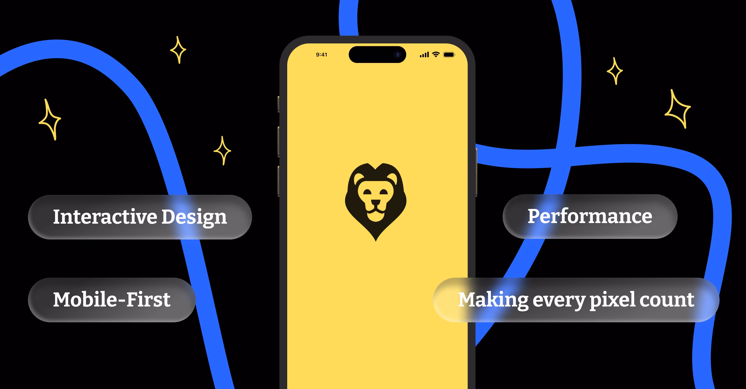
Visual Hierarchy: Making Every Pixel Count
With limited screen space, visual hierarchy becomes even more important on mobile. Users need to understand what’s most important at a glance, without having to scroll or hunt for key information. Size, color, spacing, and typography all need to work harder to guide attention.
Typography choices are particularly critical on mobile. Fonts that look elegant on desktop can become illegible on small screens. We typically use larger base font sizes for mobile to ensure readability, even in poor lighting conditions or for users with vision challenges.
Color contrast requirements become more stringent for mobile design. Screens are often viewed in various lighting conditions, from bright sunlight to dim rooms. Colors that meet accessibility standards in controlled desktop environments might fail in real-world mobile usage scenarios.
Testing: The Reality Check Your Design Needs
No amount of responsive design testing in a browser can fully replicate the mobile experience. Real device testing reveals issues that browser developer tools miss. Touch interactions feel different, performance characteristics change, and the context of use is completely different.
We maintain a collection of actual devices for testing, from the latest flagship phones to older budget devices that many users still rely on. A design that works perfectly on an iPhone 14 Pro might be unusable on a three-year-old Android phone with a smaller screen and slower processor.
Network throttling during testing helps simulate real-world conditions. That beautiful design might work great on your office’s high-speed internet, but how does it perform on a spotty 3G connection during a commute?
The Business Case: Mobile Drives Revenue
Google’s mobile-first indexing means mobile-optimized sites rank better in search results. Poor mobile experiences directly impact SEO performance, which affects organic traffic and revenue. It’s not just about user experience anymore; it’s about being found in the first place.
Mobile conversion rates traditionally lagged behind desktop, but that gap is closing rapidly as mobile experiences improve. In some industries, mobile conversions now exceed desktop conversions. E-commerce, food delivery, and local services often see higher conversion rates on mobile devices.
The cost of poor mobile design is measurable. Bounce rates increase, time on site decreases, and conversion rates plummet when mobile experiences are subpar. Fixing mobile usability issues often provides immediate, measurable improvements in key business metrics.
Future-Proofing: Beyond Smartphones
Mobile-first design principles apply beyond smartphones. Smartwatches, tablets, foldable devices, and emerging form factors all benefit from the content prioritization and progressive enhancement approaches that mobile-first design encourages.
Voice interfaces and gesture controls are becoming more common, requiring designers to think beyond visual interfaces. The core principles of mobile-first design focusing on essential functionality and clear hierarchy translate well to these emerging interaction methods.
The Internet of Things brings web interfaces to increasingly small screens and limited interaction methods. A smart thermostat interface or car dashboard display benefits from the same ruthless prioritization that makes mobile web design successful.
Mobile-first design isn’t just a technique; it’s a mindset that puts user needs and real-world usage patterns at the center of the design process. It forces designers to focus on what truly matters, creates more inclusive experiences, and often results in better desktop designs too. In a world where the majority of digital interactions happen on mobile devices, mobile-first design isn’t an option. It’s the foundation of good digital design, period.