Beautiful interfaces don’t always convert well. In fact, some of the highest-converting websites look surprisingly plain. This disconnect happens because many designers prioritize visual appeal over user psychology and business objectives.
Effective UI design isn’t about following aesthetic trends. It’s about understanding how people process information, make decisions, and take actions online. Here are the UI design principles that actually improve conversion rates.
Visual Hierarchy Guides Decision Making
People don’t read websites. They scan them. Your visual hierarchy determines what they notice and in what order, which directly impacts whether they take desired actions.
Use size, color, contrast, and positioning to guide attention toward your most important elements. Your primary call-to-action should be the most visually prominent element on the page. Secondary information should be clearly subordinate but still accessible.
Create clear paths through your content that lead toward conversion. Most users will follow the visual flow you create, so design that flow to support your business goals.
Test your hierarchy by looking at your pages quickly or squinting to blur details. The elements that still stand out are the ones users will notice first. Make sure those elements are the ones that drive business results.
Reduce Cognitive Load with Familiar Patterns
Users have limited mental energy for figuring out how interfaces work. Every moment they spend learning your system is energy they’re not spending on considering your offer.
Use established interface conventions wherever possible. Put navigation where users expect it. Make buttons look like buttons. Use familiar icons and interaction patterns.
This doesn’t mean your design has to be boring. Innovation should focus on areas that provide clear user value, not on reinventing basic interface elements that already work well.
When you do need to use unfamiliar patterns, provide clear guidance and feedback to help users understand how things work.
Strategic Use of White Space
White space isn’t empty space. It’s a design tool that affects how users perceive and interact with your content. Proper use of white space can dramatically improve conversion rates.
White space around important elements makes them more noticeable and easier to focus on. This is particularly important for call-to-action buttons, key benefits, and conversion forms.
Use white space to group related elements and separate unrelated ones. This helps users understand information hierarchy and process content more efficiently.
Don’t feel pressure to fill every pixel with content. Sometimes removing elements improves conversion more than adding them.
Color Psychology for Action
Colors trigger emotional and behavioral responses that can influence user actions. Understanding color psychology helps you design interfaces that encourage desired behaviors.
Red creates urgency and can be effective for limited-time offers or clearance sales. However, it can also signal danger or stop, so use it carefully for primary actions.
Blue builds trust and feels safe, making it effective for financial services, healthcare, and B2B companies. It’s often used for primary action buttons because it feels reliable.
Green suggests positive action and is commonly used for “go” buttons like “Buy Now” or “Sign Up.” It also connects with money and growth concepts.
Orange combines the energy of red with the friendliness of yellow. It’s attention-grabbing but less aggressive than red, making it effective for conversion buttons.
The key is contrast and consistency. Your action buttons should stand out clearly from the surrounding content, regardless of specific color choice.
Form Design That Converts
Forms are often the final step in conversion processes, which makes their design crucial for business results. Small improvements in form design can create significant improvements in conversion rates.
Minimize required fields to only what you absolutely need. Each additional field reduces completion rates. You can always collect additional information later in the relationship.
Use single-column layouts for better completion rates. Multi-column forms feel more complex and take longer to complete.
Provide clear labels and helpful placeholder text. Users should never have to guess what information you want or what format you expect.
Show progress indicators for multi-step forms so users know what to expect. People are more likely to complete processes when they can see how much remains.
Use inline validation to catch errors immediately rather than waiting until form submission. This reduces frustration and abandonment.
Button Design That Encourages Action
Buttons are the most important interactive elements on your website. Their design directly impacts whether people take desired actions.
Make buttons large enough to click easily, especially on mobile devices. Small buttons feel less important and are harder to interact with.
Use action-oriented text that tells users exactly what will happen when they click. “Get My Free Guide” is more compelling than “Submit.”
Create visual contrast between buttons and surrounding content. Primary action buttons should be the most prominent interactive elements on the page.
Design button states (hover, active, disabled) to provide clear feedback about user interactions. People need to understand when they’ve successfully triggered an action.
Loading States and Performance Feedback
Slow-loading interfaces kill conversions. But even fast interfaces need to provide feedback about what’s happening during loading and processing.
Show loading indicators for any action that takes more than a few seconds. This helps users understand that the system is working and reduces abandonment.
Use skeleton screens or progressive loading to show content structure while details load. This makes interfaces feel faster even when actual loading times haven’t improved.
Provide clear error messages and recovery options when things go wrong. Don’t just tell users something failed; tell them what to do about it.
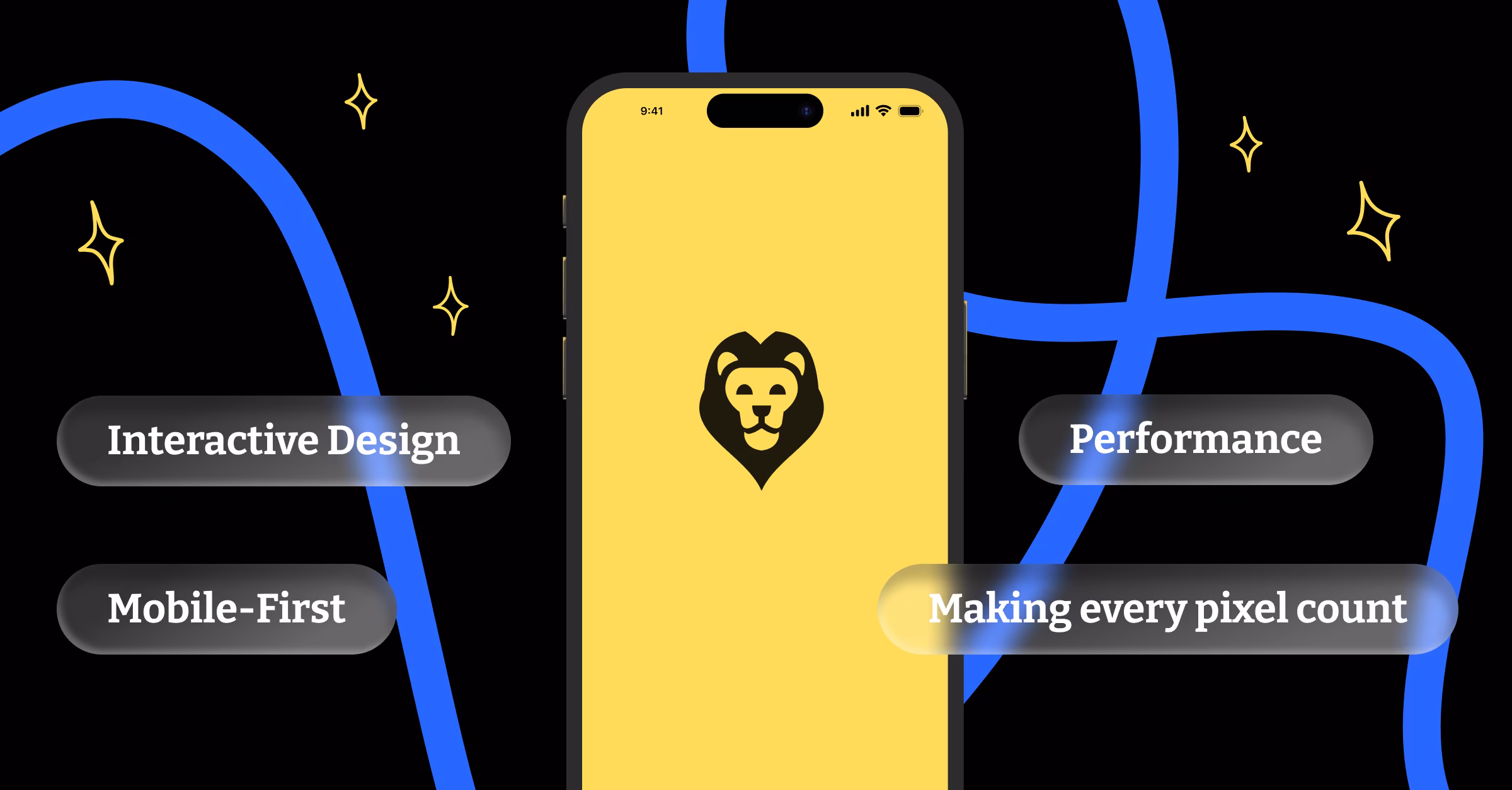
Mobile-First Interface Design
Mobile interfaces have different constraints and opportunities than desktop interfaces. Design for mobile first, then enhance for larger screens.
Touch targets need to be larger than mouse click targets. Buttons, links, and form fields should be easy to tap accurately with thumbs.
Reduce interface complexity on mobile. Hide secondary options behind clear navigation patterns. Focus on primary actions and information.
Consider thumb-reach patterns when positioning important interactive elements. The easiest areas to reach with one-handed phone use should contain your most important actions.
Testing and Iteration
The best UI designs are validated by user behavior, not designer preferences. Test your interfaces with real users and real tasks to identify improvement opportunities.
A/B test different versions of key pages to understand what works best for your specific audience. Small changes in button colors, form layouts, or content hierarchy can create significant differences in conversion rates.
Use analytics and heat mapping tools to understand how people actually interact with your interfaces. Look for patterns in user behavior that suggest confusion or friction points.
Watch users try to complete tasks on your website without any guidance. The places where they hesitate, make mistakes, or give up are opportunities for design improvements.
Measuring UI Effectiveness
Good UI design should improve business metrics, not just aesthetic appeal. Track conversion rates, task completion rates, and user satisfaction scores to measure interface effectiveness.
Monitor these metrics over time to understand how design changes impact user behavior. Sometimes changes that look better actually perform worse, and sometimes ugly changes improve business results.
Focus on metrics that matter for your business goals. E-commerce sites should track purchase completion rates. Lead generation sites should track form submissions. Content sites should track engagement and time on page.
Remember that effective UI design serves users first and business goals second. When you make interfaces easier and more pleasant to use, conversion improvements usually follow naturally. The best designs feel effortless to users while efficiently guiding them toward actions that benefit both them and your business.