Let’s talk about something that makes most designers break out in a cold sweat: accessibility. I know, I know. The word alone probably makes you think of boring compliance documents and soul-crushing checklists. But here’s the plot twist that would make M. Night Shyamalan jealous: accessibility is actually one of the most creative and rewarding aspects of design.
When I started DesignLion, I thought accessibility was something you sprinkled on top of a finished design, like parmesan cheese on pasta. Boy, was I wrong. Accessibility is more like the flour in bread. Try to add it at the end, and you’re going to have a very sad, crumbly mess.
The Numbers Game That Will Keep You Up at Night
According to the World Health Organization, over 1 billion people worldwide have some form of disability. That’s roughly 15% of the global population. If your website or app isn’t accessible, you’re potentially excluding more people than the entire population of Europe. That’s not just morally questionable; it’s bad business.
But here’s where it gets interesting. The curb-cut effect, named after those little ramps on sidewalks, shows us that designing for accessibility benefits everyone. Those ramps weren’t just made for wheelchair users. They help people with strollers, delivery workers with dollies, travelers with wheeled luggage, and anyone who’s ever tried to navigate a sidewalk while looking at their phone.
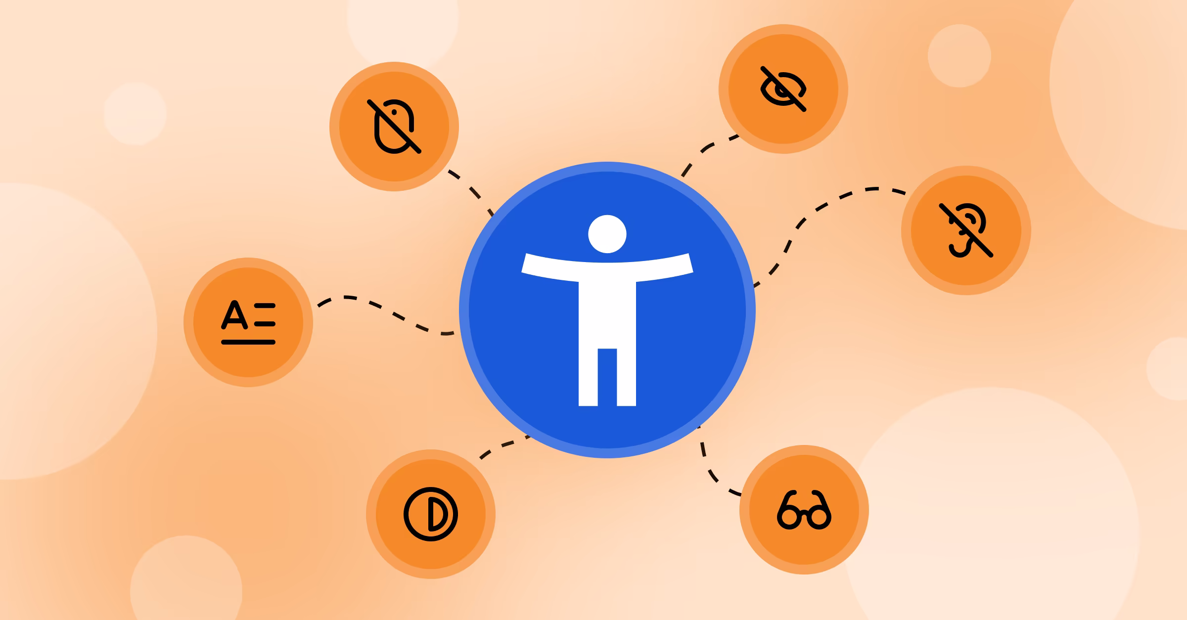
Beyond the Obvious: Understanding Different Types of Disabilities
When most people think about web accessibility, they immediately jump to screen readers and blind users. That’s like thinking the only vegetable is lettuce. There’s a whole world of accessibility considerations that most designers never even think about.
Motor disabilities affect how people interact with interfaces. Someone with arthritis might have trouble with small click targets, while someone with limited hand mobility might need keyboard navigation options. Designing for these users means thinking about touch target sizes, spacing, and alternative input methods.
Cognitive disabilities are perhaps the most overlooked category in web design. This includes conditions like dyslexia, ADHD, autism, and age-related cognitive decline. For these users, clear navigation, consistent layouts, and the ability to control timing and movement can make the difference between a usable interface and a frustrating nightmare.
The WCAG Guidelines: Your New Best Friend
The Web Content Accessibility Guidelines aren’t the boring rulebook they appear to be. Think of them as the instruction manual for building something that actually works for everyone. The guidelines are built around four principles: Perceivable, Operable, Understandable, and Robust.
Perceivable means information must be presentable in ways users can perceive. This isn’t just about making text bigger or adding alt text to images, although those are important. It’s about understanding that people consume information differently and giving them multiple ways to access it.
Operable means interface components must be operable by all users. This is where keyboard navigation becomes crucial. If someone can’t use a mouse, they should still be able to navigate your entire interface using just their keyboard. It’s like building a house with multiple entrances instead of just one.
Color Accessibility: More Complex Than You Think
Remember learning about primary colors in kindergarten? Well, accessibility in color usage is like getting a PhD in art theory. It’s not just about avoiding red-green combinations for colorblind users, although that’s important too.
Color should never be the only way to convey information. If you’re using red to indicate errors, make sure you also use icons, text, or other visual cues. This helps not just colorblind users, but anyone viewing your site in unusual lighting conditions or on a screen with poor color reproduction.
We learned this lesson the hard way when designing a dashboard for a logistics company. The original design used only color coding to show delivery status. During user testing, we discovered that several employees couldn’t distinguish between “in transit” and “delayed” statuses. A simple addition of icons and text labels solved the problem and actually made the interface clearer for everyone.
Screen Readers: The Invisible Users You Need to Design For
Screen readers are like having someone read a newspaper to you, except the newspaper is a website, and the person reading has never seen it before. If your HTML structure is messy, it’s like handing them a newspaper that’s been through a blender.
Proper heading structure is crucial for screen reader users. They navigate through content using headings as landmarks, jumping from H1 to H2 to H3 like hopscotch. When headings are used just for styling instead of structure, it’s like rearranging all the street signs in a city randomly. People are going to get lost.
Alt text for images is another critical component, but writing good alt text is an art form. It’s not about describing every detail in the image; it’s about conveying the essential information or function. An alt text of “red button” isn’t helpful. “Submit form button” tells the user exactly what they need to know.
Keyboard Navigation: The Forgotten Art
Mouse users take for granted the ability to click anywhere on a page instantly. Keyboard users have to tab through every interactive element to reach their destination. It’s like the difference between teleporting and walking. Both get you there, but one requires a lot more patience.
Focus indicators are like breadcrumbs for keyboard users. They show where you are in the interface at any given moment. Yet somehow, many designers think these indicators are ugly and try to remove them. That’s like removing all the street lights in a city because they don’t match the aesthetic.
We always design custom focus indicators that match the overall design aesthetic. It’s possible to make them both functional and beautiful. In fact, thoughtful focus indicators can enhance the visual design rather than detract from it.
Mobile Accessibility: The Wild West of Touch Interfaces
Mobile accessibility is like regular accessibility’s younger sibling who plays by different rules. Touch targets need to be large enough for fingers of all sizes and dexterity levels. The recommended minimum is 44×44 pixels, but we often go larger because hitting a small target on a mobile device while walking or in a moving vehicle is challenging for anyone.
Gesture-based navigation needs alternatives for users who can’t perform complex touch gestures. That cool swipe-to-delete feature needs a backup option, like a long press or a dedicated delete button. It’s about giving users multiple ways to accomplish the same task.
Testing with Real Users: The Reality Check You Need
Automated accessibility testing tools are helpful, but they’re like spell-checkers for writing. They catch obvious mistakes but miss nuanced issues. The only way to really know if your interface is accessible is to test it with actual users who have disabilities.
We partner with local disability organizations for user testing sessions. The insights we gain are invaluable and often surprising. Things that seem obvious to designers can be completely unintuitive to users with different abilities and ways of interacting with technology.
The Legal Landscape: Why Accessibility Isn’t Optional Anymore
Accessibility lawsuits are increasing exponentially. In 2023, there were over 4000 federal accessibility lawsuits filed in the United States alone. The cost of retrofitting an inaccessible website far exceeds the cost of building it right the first time.
But beyond legal compliance, there’s a competitive advantage to be gained. When your competitors are ignoring accessibility, building an inclusive product sets you apart. It’s like being the only restaurant in town that accommodates dietary restrictions. People notice, and they remember.
Tools and Resources That Make Accessibility Easier
WAVE Web Accessibility Evaluator is like having an accessibility consultant built into your browser. It identifies accessibility errors and provides suggestions for fixes. For designers working in Figma, the Able plugin helps catch accessibility issues during the design phase.
Color Oracle simulates different types of color blindness, letting you see your designs through different eyes. It’s sobering to realize how many design decisions assume normal color vision.
Building an Accessibility-First Culture
Accessibility isn’t something you can bolt onto a project at the end. It needs to be baked into your design process from the very beginning. This means including accessibility considerations in wireframes, design systems, and user stories.
We’ve made accessibility part of our design critiques. Every design review includes questions about keyboard navigation, color contrast, and screen reader compatibility. It’s become second nature, like checking your spelling before hitting send.
The beautiful thing about designing for accessibility is that it forces you to think more deeply about your users and their needs. It makes you a better designer, creates more inclusive products, and ultimately leads to solutions that work better for everyone. And in a world where user experience is everything, that’s not just the right thing to do. It’s the smart thing to do.