You know that moment when you’re scrolling through a website and your eyes start watering? No, you’re not having an emotional breakdown over the lack of good pizza in your area. You’re probably looking at a design that has the contrast sensitivity of a bat in broad daylight.
As the founder of DesignLion, I’ve seen more UI designs than a teenager sees TikTok videos, and let me tell you, poor contrast is the silent killer of user experience. It’s like serving someone a gourmet meal in complete darkness. Sure, the food might be amazing, but good luck finding your mouth.
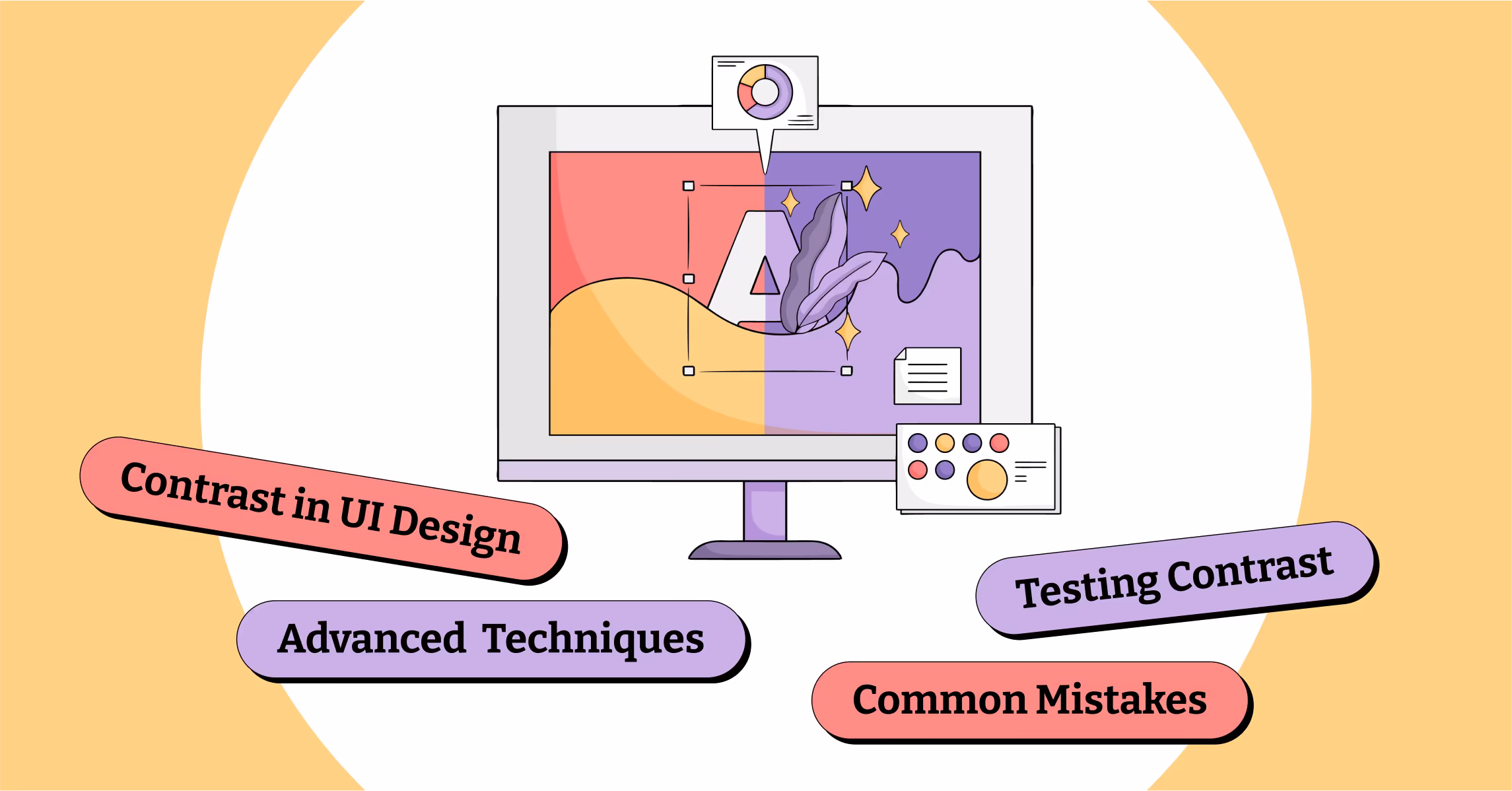
What Exactly Is Contrast Anyway
Contrast in UI design is the difference in luminance or color that makes an object distinguishable from other objects and the background. Think of it as the visual equivalent of speaking clearly instead of mumbling into your sleeve during a presentation.
The Web Content Accessibility Guidelines recommend a contrast ratio of at least 4.5:1 for normal text and 3:1 for large text. But here’s the thing that most designers miss: meeting the minimum requirements is like doing the bare minimum at your job. Sure, you won’t get fired, but you’re not exactly going to impress anyone either.
The Science Behind Why Our Eyes Love Good Contrast
Our eyes are basically biological cameras that have been optimized over millions of years to detect differences in light and shadow. When you create good contrast, you’re working with evolution, not against it. It’s like having gravity help you walk downstairs instead of trying to walk up them backwards while blindfolded.
Research shows that users can scan content up to 60% faster when proper contrast is used. That might not sound like much, but in the world of web design, where attention spans are shorter than a goldfish having an existential crisis, every millisecond counts.
Color Contrast: More Than Just Black and White
Many designers think contrast is just about making text dark enough against light backgrounds. That’s like thinking cooking is just about not burning things. Sure, it’s important, but there’s so much more to explore.
Color contrast involves understanding how different hues interact with each other. Red text on a green background might have adequate luminance contrast, but it’s going to make your users feel like they’re reading through 3D glasses from the 1980s. Not exactly the user experience you’re going for, unless you’re designing a website for a retro movie theater.
The Emotional Psychology of Contrast
High contrast creates tension and energy, while low contrast feels calm and sophisticated. It’s like the difference between a heavy metal concert and a spa day. Both have their place, but you wouldn’t want to mix them up.
When we designed a website for a meditation app, we used subtle, low-contrast elements to create a sense of peace and tranquility. But when we worked on a fitness brand, we cranked up the contrast to create energy and motivation. The key is understanding what emotional response you want to trigger in your users.
Common Contrast Mistakes That Make Designers Cry
The gray text epidemic is real, and it’s spreading faster than rumors in a small town. Somewhere along the way, designers decided that making text lighter would make it look more modern and sophisticated. The result is websites that look like they were designed for people with superhuman vision.
Another common mistake is relying solely on color to convey information. This is like trying to give directions using only interpretive dance. It might work for some people, but you’re going to leave a lot of folks confused and frustrated.
Tools That Will Save Your Contrast Game
WebAIM’s Color Contrast Checker is like having a personal trainer for your color choices. It’ll tell you exactly where you stand with WCAG guidelines and won’t sugarcoat the results.
For those who prefer to stay in their design tools, plugins like Stark for Figma and Sketch can check contrast in real-time. It’s like having a spell-checker, but for accessibility. Because nothing says professional like realizing your carefully crafted design is completely unreadable after you’ve already presented it to the client.
Testing Contrast in the Real World
Here’s something most designers don’t think about: your beautiful high-resolution monitor in your perfectly lit office isn’t where most people will experience your design. They’ll be looking at it on their phone while walking down a sunny street, or on their laptop in a coffee shop with terrible lighting.
We always test our designs in different lighting conditions and on various devices. It’s amazing how that subtle gray text that looked sophisticated on your MacBook Pro suddenly becomes invisible on a cheap Android phone in bright sunlight.
Advanced Contrast Techniques
Once you’ve mastered basic contrast, you can start playing with more advanced techniques. Layered contrast involves creating multiple levels of visual hierarchy through different contrast ratios. It’s like conducting an orchestra where every instrument has its perfect volume level.
Progressive contrast guides users through your interface step by step. Important actions get high contrast, while secondary elements fade into the background. It’s like being a good host at a party, making sure everyone knows where the bathroom is without having to ask.
The Business Case for Better Contrast
Better contrast isn’t just about being nice to your users’ eyes. It’s about money. Higher contrast leads to better readability, which leads to longer time on site, which leads to better conversion rates. We’ve seen conversion rates improve by up to 30% just by fixing contrast issues on landing pages.
Accessibility isn’t a nice-to-have feature anymore. It’s a legal requirement in many places, and lawsuits over inaccessible websites are becoming more common. Think of good contrast as insurance for your business, except this insurance actually makes your product better instead of just protecting you from disaster.
Remember, contrast in UI design is like seasoning in cooking. Too little and everything tastes bland. Too much and you overwhelm the palate. But when you get it just right, everything clicks into place, and your users will thank you for it, even if they don’t realize why their experience was so smooth.