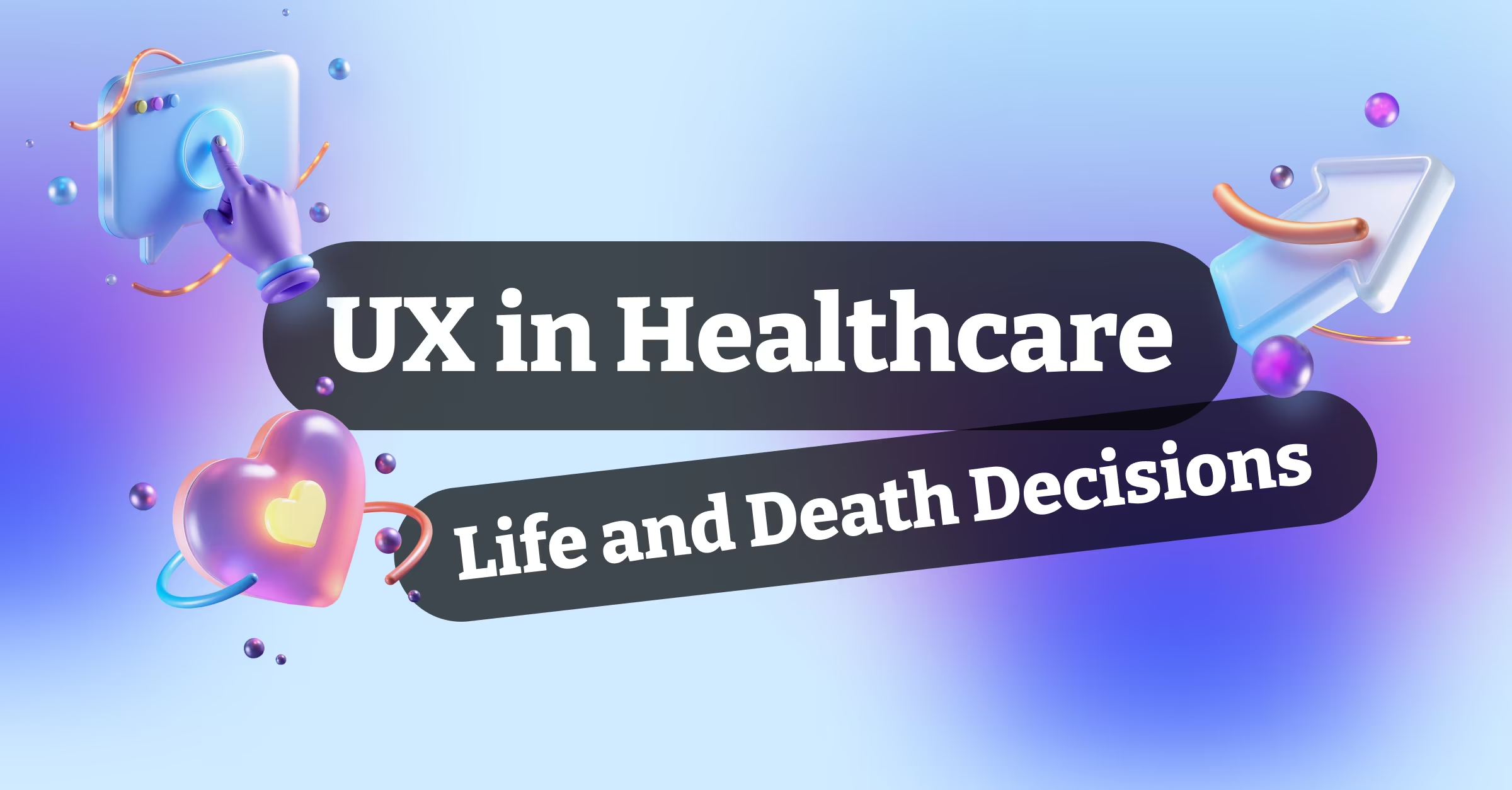
The notification came at 2 AM. A user of a healthcare app we’d designed was trying to report severe chest pain through the symptom tracker, but couldn’t figure out how to mark it as urgent. The interface that seemed intuitive during our design reviews was failing someone who might be having a heart attack.
That moment changed how I approach healthcare UX forever. This isn’t about conversion rates or engagement metrics. When you’re designing healthcare applications, you’re designing for moments when confusion can be life-threatening and clarity can save lives.
The Stakes Are Different
Most apps fight for attention. Healthcare apps need to provide information quickly and accurately when users are scared, in pain, or making critical health decisions. The design principles that work for social media or e-commerce don’t just fail in healthcare; they can be dangerous.
Consider the cognitive load of someone experiencing a medical emergency. Their stress levels are elevated, their attention is focused on their symptoms, and their ability to process complex interfaces is severely compromised. Your beautiful, award-winning design means nothing if it can’t function under these conditions.
We learned this designing a medication management app for elderly patients. What seemed like simple navigation to our team was completely overwhelming to users dealing with multiple prescriptions, vision issues, and technology anxiety. The interface needed to be dramatically simplified before it became usable.
Trust: The Foundation of Healthcare UX
Trust in healthcare apps isn’t built through flashy animations or clever interactions. It’s built through reliability, transparency, and respect for user vulnerability. Every design decision should communicate competence and caring.
Visual design plays a crucial role here. Clean, professional aesthetics signal reliability. Consistent typography and layout patterns reduce cognitive load. Appropriate use of white space prevents information overload. These aren’t just aesthetic choices; they’re trust-building mechanisms.
Color psychology becomes critical in healthcare contexts. Red can signal danger or urgency, but it can also increase anxiety. Blue suggests calm and trust but might feel cold in emotional contexts. Green implies health and safety but can seem clinical. We test color choices extensively with target users to understand emotional responses.
Information Architecture for Medical Complexity
Healthcare information is inherently complex. Medical terminology, dosage instructions, symptom descriptions, and treatment plans involve details that can’t be oversimplified without losing meaning. The challenge is organizing this complexity in ways that don’t overwhelm users.
Progressive disclosure becomes essential. Start with the most critical information and allow users to drill down for details. A medication reminder should show the drug name and dosage prominently, with side effects and detailed instructions available through clear secondary actions.
Search functionality needs to account for medical terminology confusion. Users might search for “heart attack” when the medical term is “myocardial infarction,” or use brand names instead of generic drug names. Smart search algorithms and synonym recognition prevent users from missing critical information.
Accessibility: Not Optional in Healthcare
Accessibility in healthcare apps isn’t about compliance checkboxes. It’s about ensuring that people with disabilities, vision problems, motor difficulties, or cognitive challenges can access potentially life-saving information.
We design for screen readers from the beginning, not as an afterthought. This means semantic HTML structure, proper heading hierarchies, and descriptive alt text for all images. Medical charts and graphs need text alternatives that convey the same information to users who can’t see visual representations.
Font size and contrast requirements become more stringent when your users include elderly patients or people with vision impairments. We use larger base font sizes and higher contrast ratios than typical web standards recommend.
Voice interfaces show particular promise in healthcare settings. Hands-free interaction helps users with mobility limitations, and voice input can be faster than typing for users reporting symptoms or asking questions.
Privacy and Security: User Experience Implications
HIPAA compliance isn’t just a legal requirement; it’s a user experience consideration. Users need to understand how their health data is protected without being overwhelmed by legal jargon. Privacy controls need to be discoverable and understandable.
Biometric authentication makes sense for healthcare apps because it balances security with usability. Fingerprint or face unlock provides strong security without requiring users to remember complex passwords, which is especially important for users taking medications that might affect memory.
Data export and portability features become user experience requirements. Users should be able to access their health data in formats they can share with healthcare providers. This often means supporting PDF exports, printed summaries, or integration with other health platforms.
Emergency Scenarios: Designing for Crisis
Healthcare apps must function during medical emergencies when users are panicked, in pain, or operating under severe time pressure. This requires different design approaches than typical user scenarios.
Emergency features need to be accessible from any screen in the app. We implement floating action buttons or persistent bottom navigation that includes emergency contact options. The path to critical functions should never be more than two taps from any screen.
Voice commands become essential during emergencies when users might not be able to look at screens or use their hands effectively. “Call emergency contact” or “start symptom checker” should work from voice activation.
Offline functionality prevents emergency features from failing when internet connectivity is poor. Critical health information, emergency contacts, and basic symptom assessment tools should work without network access.
User Testing: The Ethical Considerations
Testing healthcare apps with real patients involves ethical considerations that don’t exist in other domains. You’re asking people to share intimate health information and potentially trigger anxiety about their medical conditions.
We partner with healthcare providers for user testing because they can provide appropriate support for participants and ensure ethical research practices. Testing environments need to feel safe and private, and participants need clear information about data handling.
Prototype testing uses simulated health scenarios rather than asking users to input real medical information. This protects participant privacy while still providing valuable usability feedback.
Personalization vs. Medical Accuracy
Healthcare apps walk a fine line between personalization and medical accuracy. While customization improves user experience, medical information can’t be oversimplified or personalized in ways that compromise accuracy.
Medication reminders can be personalized for timing and notification style, but dosage information must remain exactly as prescribed. Symptom tracking can adapt to individual medical histories, but diagnostic suggestions must follow evidence-based medical protocols.
We involve medical professionals in all personalization decisions to ensure that user experience improvements don’t introduce medical risks. Some aspects of healthcare apps simply can’t be optimized for user preference when medical accuracy is at stake.
Integration with Healthcare Systems
Healthcare apps don’t exist in isolation. They need to integrate with electronic health records, pharmacy systems, wearable devices, and other health platforms. These integrations create UX opportunities and challenges.
Single sign-on with healthcare provider systems reduces friction for users who are already overwhelmed by multiple health-related accounts and passwords. However, these integrations must maintain security standards and provide clear information about data sharing.
Wearable device integration can provide valuable health data, but the interface needs to help users understand what the data means without encouraging over-interpretation or health anxiety.
The Human Element
The most important principle in healthcare UX is remembering that behind every user interaction is a human being dealing with health concerns, medical complexity, and often fear or uncertainty. Technology should reduce these burdens, not add to them.
We design for emotional states that don’t exist in other app categories: the anxiety of waiting for test results, the confusion of managing multiple medications, the fear of making the wrong health decision. These emotional contexts influence every design choice.
Empathy isn’t just a nice-to-have in healthcare UX; it’s a professional requirement. Every team member needs to understand what it feels like to be sick, scared, or dealing with complex medical information. We regularly involve healthcare professionals and patients in our design process to maintain this perspective.
Measuring Success Differently
Traditional UX metrics don’t capture what matters in healthcare apps. Time on site might indicate confusion rather than engagement. Click-through rates might reflect anxiety rather than interest. We measure success through health outcomes, user confidence, and clinical utility.
Patient satisfaction scores and clinical outcome improvements provide better success metrics than typical app analytics. We track whether users feel more confident managing their health, whether they’re more likely to follow treatment plans, and whether healthcare providers find the app useful in patient care.
The Future of Healthcare UX
Healthcare UX is evolving rapidly as technology advances and healthcare delivery changes. AI-powered symptom assessment, telemedicine integration, and personalized health recommendations are becoming standard features.
However, the fundamental principles remain constant: clarity over cleverness, accuracy over engagement, and trust over innovation. The fanciest technology is worthless if users can’t figure out how to use it when they need it most.
Healthcare UX design isn’t about creating the next viral app or winning design awards. It’s about creating tools that help people manage their health more effectively, communicate with healthcare providers more clearly, and feel more confident about their medical decisions.
When you get it right, you’re not just improving user experience metrics. You’re potentially saving lives, reducing anxiety, and helping people take better care of themselves. That’s the kind of impact that makes all the complexity and constraints worthwhile.
The responsibility is enormous, but so is the opportunity to use design skills for genuine social good. Healthcare UX isn’t the easiest path for designers, but it might be the most meaningful one.