Your website traffic looks great. People are finding you, clicking through from ads, and landing on your pages. But then something goes wrong. They don’t convert. They don’t buy. They don’t even stick around long enough to understand what you’re offering.
Sound familiar? You’re probably making one of the common UX mistakes that turn interested visitors into frustrated abandoners. The good news is that these problems are usually easy to fix once you identify them.
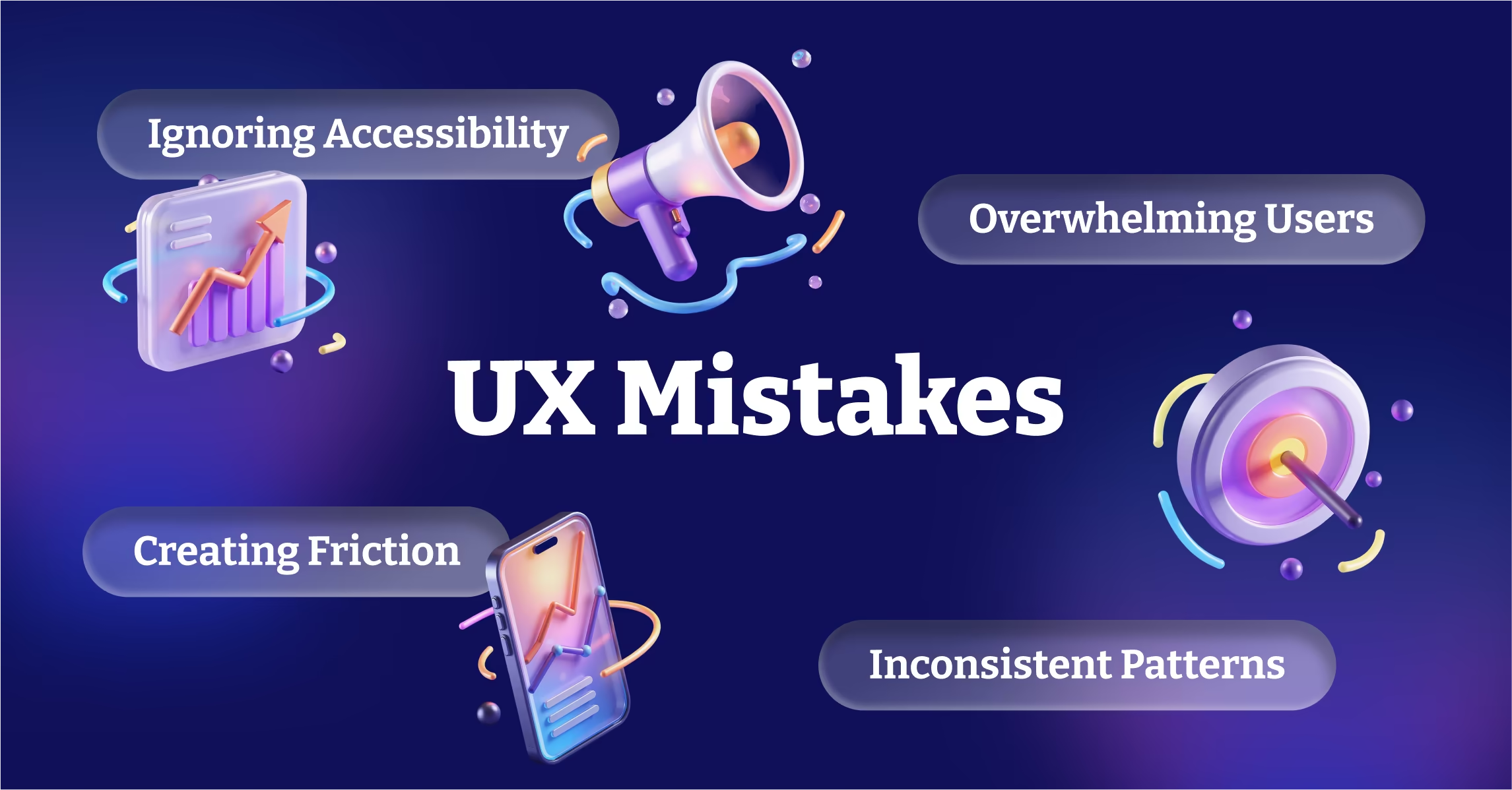
Here are the UX issues that are costing you customers, and what you can do about them.
Mistake 1: Making People Think Too Hard
Your users don’t want to solve puzzles. They want to accomplish goals quickly and easily. Every moment they spend figuring out how your website works is a moment they’re not focused on why they should buy from you.
Common examples include unclear navigation labels, mysterious icons without text descriptions, and multi-step processes without clear progress indicators. When users have to guess what something does or where it leads, many will simply leave instead of experimenting.
The fix is ruthless clarity. Use familiar words for navigation instead of creative alternatives. Include text labels with icons. Show users exactly where they are in multi-step processes and what comes next.
Test your site with people who haven’t seen it before. Watch them try to complete common tasks without any guidance. The places where they hesitate or click the wrong things are opportunities for improvement.
Mistake 2: Hiding Your Value Proposition
You know what makes your business special. Your visitors don’t. Yet many websites bury their key benefits in dense paragraphs or assume people will figure out why they should care.
Your value proposition should be immediately obvious to someone who lands on your homepage. They should understand what you do, who you serve, and why you’re different within the first few seconds.
This doesn’t mean you need a clever tagline. It means you need clear, specific language that connects your offering to customer needs. Instead of “innovative solutions,” explain exactly what problem you solve. Instead of “quality service,” describe what that service accomplishes for customers.
Place your strongest benefits prominently on every important page. Don’t make people hunt for reasons to choose you over competitors.
Mistake 3: Creating Friction in the Conversion Process
Every additional step between interest and action reduces conversion rates. Yet many websites create unnecessary obstacles that stop motivated customers from buying.
Common friction points include requiring account creation before purchase, asking for information you don’t actually need, and spreading simple processes across multiple pages.
Audit your conversion funnel ruthlessly. Remove every field, step, and requirement that isn’t absolutely necessary. Offer guest checkout options. Use smart defaults and auto-fill when possible. Let people complete actions first and provide additional information later.
The goal is to make saying yes as easy as possible. Every additional click or form field should earn its place by providing clear value to the user.
Mistake 4: Ignoring Mobile User Behavior
Mobile users behave differently than desktop users, but many websites treat mobile as just a smaller version of the desktop experience.
Mobile users are more impatient, more likely to abandon complex tasks, and more focused on immediate needs. They’re also more likely to be comparing options while standing in a store or making time-sensitive decisions.
Design mobile experiences that acknowledge these behavioral differences. Prioritize the most important information and actions. Simplify navigation and reduce cognitive load. Make contact information immediately accessible with click-to-call functionality.
Test your mobile experience in real-world conditions, not just on your office WiFi. Slow connections and older devices reveal problems that perfect testing environments hide.
Mistake 5: Overwhelming Users with Choices
More options seem better, but psychological research consistently shows that too many choices lead to decision paralysis. When people face overwhelming arrays of options, they often choose nothing at all.
This applies to navigation menus with dozens of links, product pages with unlimited filtering options, and service descriptions that list every possible feature without prioritization.
Guide users toward decisions instead of presenting endless options. Highlight recommended products or popular choices. Use progressive disclosure to show basic options first and reveal advanced options only when requested.
Create clear paths through your content that lead toward conversion. Most users want guidance, not complete freedom to explore every possibility.
Mistake 6: Neglecting Loading Speed
Users expect fast experiences. Research shows that even one-second delays in loading time significantly impact conversion rates. On mobile devices, where connections may be slower, speed becomes even more critical.
Large images, excessive scripts, and unoptimized code create loading delays that cost you customers. Many users will abandon a site that doesn’t load within a few seconds.
Optimize images for web viewing without sacrificing quality. Minimize and compress code. Use content delivery networks to serve files from locations closer to users. Implement lazy loading for content that’s not immediately visible.
Monitor your site speed regularly and set performance budgets for new features. Every element you add should be evaluated based on its impact on loading times.
Mistake 7: Poor Error Handling and Dead Ends
When something goes wrong on your website, how do you handle it? Many sites display generic error messages that leave users stranded without clear next steps.
404 pages, form validation errors, and system messages are opportunities to guide users back toward successful completion of their goals. Instead of simply stating that something went wrong, provide specific guidance on how to fix the problem or alternative ways to accomplish the same goal.
Make error messages helpful and actionable. Instead of “Error 404,” explain what happened and provide links to popular pages or a search function. Instead of “Invalid input,” specify exactly what format you need and why.
Mistake 8: Inconsistent Interface Patterns
When users learn how something works on one page of your site, they expect similar elements to work the same way throughout. Inconsistent button styles, navigation patterns, or interaction behaviors create confusion and reduce confidence.
Develop and document interface standards for your website. Buttons should look and behave consistently. Navigation should work the same way across all pages. Similar functions should use similar visual cues.
This consistency extends beyond visual design to interaction patterns. If clicking something opens a new page in one location, similar elements shouldn’t open popup windows elsewhere without clear indication.
Mistake 9: Ignoring Accessibility
Accessibility isn’t just about compliance with legal requirements. It’s about creating experiences that work for all users, including those with disabilities, older users, and people using assistive technologies.
Many accessibility improvements also benefit all users. Clear color contrast makes text easier to read for everyone. Proper heading structure helps screen readers and search engines understand your content. Keyboard navigation helps people who can’t use a mouse for various reasons.
Basic accessibility improvements include sufficient color contrast, alternative text for images, proper heading hierarchy, and keyboard-accessible navigation. These changes often improve your site’s search engine optimization as well.
The Fix: User-Centered Design Process
The solution to most UX problems starts with understanding your actual users rather than assuming what they want. Conduct user research to understand their goals, frustrations, and behavioral patterns.
Test your designs with real users throughout the development process, not just after launch. Small usability studies with five or six participants can identify major problems before they impact your entire customer base.
Measure user behavior with analytics tools, but also observe qualitative patterns. Heat mapping tools show where people click and scroll. Session recordings reveal where users get confused or stuck.
Most importantly, prioritize fixes based on their impact on user goals and business objectives. Not every UX improvement is worth the development time. Focus on changes that remove barriers to conversion and improve satisfaction for your most important user flows.
When you eliminate friction, clarify value propositions, and guide users toward successful task completion, you’ll see improvements in conversion rates, customer satisfaction, and business growth. Good UX design isn’t about following best practices blindly. It’s about creating experiences that work for your specific users and business goals.