Your logo appears on everything. Business cards, websites, social media profiles, email signatures, products, packaging. It’s often the first thing potential customers see and the last thing they remember.
Yet most business owners approach logo design like they’re picking a favorite color. They choose what looks good to them personally, without considering what it communicates to their target audience.
Here’s the reality: effective logo design isn’t about personal taste. It’s about psychology. The best logos work because they tap into how human brains process visual information and make decisions.
Shape Psychology: What Your Logo’s Form Says About Your Business
Before anyone reads your company name or understands what you do, their brain is already forming impressions based on the shapes in your logo.
Circles and curved elements suggest friendliness, community, and approachability. They feel organic and human. This is why many healthcare, education, and service-based businesses use circular logos. Think of the warmth conveyed by logos like Target or the Olympics.
Sharp angles and straight lines communicate strength, stability, and professionalism. They feel structured and reliable. Financial institutions, law firms, and technology companies often use angular designs to project trustworthiness and competence.
Triangular shapes suggest movement, innovation, and progress. They’re dynamic and forward-thinking. This makes them popular with startups and companies that want to emphasize growth or cutting-edge solutions.
Your logo’s basic shape should align with how you want customers to feel about your business before they even know what you do.
Color Psychology: The Emotional Impact of Your Brand Palette
Color choices trigger immediate emotional responses that happen faster than conscious thought. Different colors activate different parts of the brain and influence behavior in predictable ways.
Red creates urgency and excitement. It increases heart rate and stimulates appetite, which is why it’s dominant in fast food branding. Red also suggests energy and passion, making it effective for entertainment, sports, and emergency services.
Blue builds trust and suggests competence. It’s calming and professional, which explains its popularity in finance, healthcare, and technology. Different shades convey different messages: navy blue feels established and authoritative, while lighter blues feel approachable and innovative.
Green represents growth, health, and prosperity. It’s restful to look at and suggests natural, sustainable, or financial themes. Many organic food brands, environmental companies, and financial services use green to reinforce these associations.
Black communicates luxury, sophistication, and exclusivity. It’s the color of premium brands that want to suggest quality and status. Fashion, automotive, and high-end service companies often use black to position themselves as upscale options.
The wrong color can undermine your message before anyone reads your copy or understands your offering.
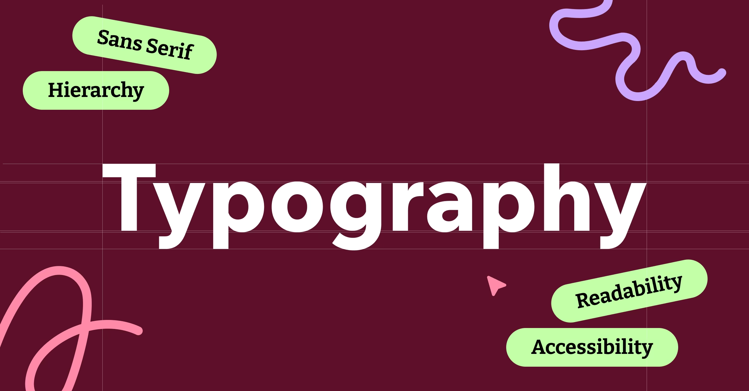
Typography Psychology: How Letter Shapes Influence Perception
The font you choose for your logo communicates personality traits that influence how people perceive your business.
Serif fonts (with small lines attached to letters) feel traditional, trustworthy, and established. They suggest history, reliability, and attention to detail. Law firms, educational institutions, and luxury brands often use serif fonts to convey gravitas and permanence.
Sans-serif fonts (without extra lines) feel modern, clean, and efficient. They suggest innovation, simplicity, and forward-thinking. Technology companies, startups, and design-focused businesses gravitate toward sans-serif fonts to appear contemporary and streamlined.
Script fonts mimic handwriting and feel personal, creative, and elegant. They work well for businesses that want to emphasize craftsmanship, creativity, or personal service. However, they can be harder to read, especially at small sizes.
Bold, heavy fonts suggest strength and confidence. They command attention and feel powerful. This makes them effective for sports teams, construction companies, and brands that want to project authority.
Your font choice should reflect your brand personality, but it also needs to work across all applications. A script font might look beautiful on a business card but become illegible on a social media profile picture.
The Recognition Factor: Why Simple Logos Win
Human brains are pattern recognition machines, but they have limited processing capacity. Simple designs are easier to recognize, remember, and reproduce accurately across different contexts.
Think about the most memorable logos you know. Apple’s apple. Nike’s swoosh. McDonald’s golden arches. None of these designs are complex, but they’re instantly recognizable because they focus on a single, distinctive element.
Complex logos with multiple colors, fonts, and graphic elements might look impressive in large format, but they fall apart when scaled down to favicon size or embroidered on a shirt. They’re also harder for people to remember and describe to others.
Simplicity isn’t about being boring. It’s about being memorable. Your logo needs to work at thumbnail size on a smartphone screen and billboard size on a highway. Simple, distinctive designs accomplish this better than complex ones.
Cultural Context: What Your Logo Means to Your Audience
Color meanings and shape associations vary across cultures and demographics. Red means luck in China but danger in Western contexts. Certain geometric patterns have religious or cultural significance that might not align with your brand message.
If your business serves diverse markets, research how your design choices might be interpreted by different groups. What feels premium to one audience might feel intimidating to another. What seems playful to young customers might seem unprofessional to older ones.
Your logo doesn’t exist in a vacuum. It competes for attention with thousands of other visual messages your audience sees every day. Understanding your specific market’s visual preferences and cultural context helps your logo communicate effectively rather than accidentally.
Testing Your Logo: Beyond Personal Preference
The only opinion that matters about your logo is your target customer’s opinion. Before finalizing any design, test it with real people from your target market.
Show them your logo alongside competitors’ logos. Which one feels most trustworthy? Most innovative? Most approachable? Which business would they be most likely to contact?
Test at different sizes and in different contexts. How does it look on a business card versus a website header versus a social media profile? Does it maintain its impact and legibility across all applications?
Ask people to describe what they think your business does based solely on your logo. If their assumptions don’t align with your actual services, your design might be sending the wrong psychological signals.
Your logo is working when it helps the right people make positive assumptions about your business before they know anything else about you. That’s the real power of design psychology in action.