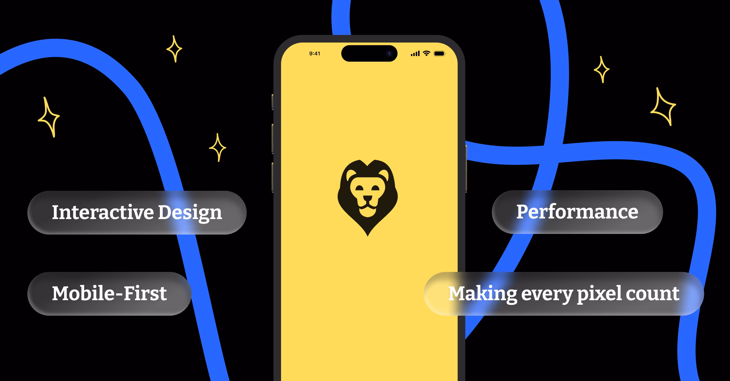
Here’s a statistic that should change how you think about web design: over 60% of web traffic now comes from mobile devices. For many businesses, that number is even higher.
Yet when I audit websites for potential clients, I consistently find the same problem. Beautiful desktop experiences that completely fall apart on mobile devices. Navigation menus that don’t work on touchscreens. Text that’s too small to read without zooming. Buttons placed too close together for accurate tapping.
These aren’t just minor inconveniences. They’re business killers. When your mobile experience is poor, you’re not just losing visitors. You’re losing customers to competitors who understand that mobile isn’t just another screen size. It’s a completely different context.
The Mobile Context is Different
Desktop users typically have focused attention, stable internet connections, and precise input methods. They’re often researching, comparing options, or completing complex tasks.
Mobile users are distracted, impatient, and task-oriented. They’re standing in line, sitting in waiting rooms, or walking between appointments. They want quick answers and fast actions. They’ll abandon your site within seconds if it doesn’t immediately serve their needs.
This context difference means mobile design isn’t about making your desktop site smaller. It’s about rethinking what your users need and how they’ll interact with your content.
Touch Interface Considerations
Mouse cursors are precise. Fingers are not. The average finger tap covers about 44 pixels, which means your click targets need to be larger and spaced further apart than desktop elements.
Small text links that work perfectly with a mouse become frustrating on touchscreens. Users accidentally tap the wrong elements, struggle to select text, and eventually give up on tasks that seemed simple on desktop.
Design for thumbs, not cursors. Place important actions within easy reach of someone holding their phone in one hand. Make buttons large enough to tap confidently. Leave plenty of space between interactive elements.
Loading Speed Matters More on Mobile
Mobile connections are often slower and less reliable than desktop broadband. Users on cellular networks, public WiFi, or older devices expect sites to load quickly despite these limitations.
Every second of loading time increases abandonment rates. On mobile, where users are more impatient and easily distracted, slow loading isn’t just annoying. It’s a conversion killer.
Optimize images for mobile viewing. Minimize code and external resources. Use lazy loading for content that’s not immediately visible. Prioritize above-the-fold content so users can start engaging with your site before everything finishes loading.
Content Strategy for Small Screens
Desktop screens have room for detailed explanations, multiple navigation options, and comprehensive information. Mobile screens don’t.
This doesn’t mean mobile users want less information. It means they want it organized differently. They need clear hierarchies, scannable content, and immediate access to the most important information.
Lead with your key message. Use clear headings and short paragraphs. Break up text with visual elements. Make phone numbers and addresses immediately actionable with click-to-call and mapping integration.
Navigation That Works on Touchscreens
Desktop navigation can be complex because users have precision input and hover states to reveal additional options. Mobile navigation needs to be obvious and immediate.
Hamburger menus work, but only if users understand what they contain. Consider hybrid approaches that show your most important pages directly while hiding secondary options in a collapsible menu.
Make navigation elements large enough to tap easily. Use clear labels instead of icons when possible. Test your navigation with real users to identify confusion points.
Forms and Input Fields
Typing on mobile devices is slower and more error-prone than desktop typing. Long forms that seem reasonable on desktop become tedious obstacles on mobile.
Minimize required fields. Use appropriate input types to trigger the right keyboard layouts. Implement auto-complete and smart defaults where possible. Consider alternative input methods like voice or image capture.
Make error messages clear and immediately actionable. Position them where users will see them without scrolling. Allow easy correction of mistakes without losing other entered data.
The Mobile-First Design Process
Instead of designing for desktop and adapting for mobile, start with mobile constraints and enhance for larger screens. This approach forces you to prioritize essential content and functionality.
Begin with the smallest screen size you need to support. Design core user flows that work within these constraints. Then gradually add enhancements for larger screens without breaking the mobile experience.
This process naturally creates cleaner, more focused designs. When you start with limited space, you’re forced to eliminate unnecessary elements and prioritize what truly matters to users.
Testing Across Real Devices
Browser developer tools are useful for initial testing, but they don’t replicate the real mobile experience. Touch interactions, network conditions, and device performance vary significantly across actual mobile devices.
Test on multiple devices with different screen sizes, operating systems, and connection speeds. Include older devices that your users might still be using. Test in real-world conditions, not just perfect office WiFi.
Pay attention to loading performance, touch interactions, and content readability. Features that work perfectly in desktop browsers might fail on actual mobile devices.
Performance Monitoring and Optimization
Mobile performance varies based on device capabilities, network conditions, and user behavior patterns. Regular monitoring helps you identify and fix issues before they impact significant numbers of users.
Use tools like Google PageSpeed Insights and WebPageTest to analyze mobile performance. Monitor Core Web Vitals metrics that directly impact user experience and search rankings.
Set performance budgets and stick to them. Every new feature or piece of content should be evaluated based on its impact on mobile loading times and user experience.
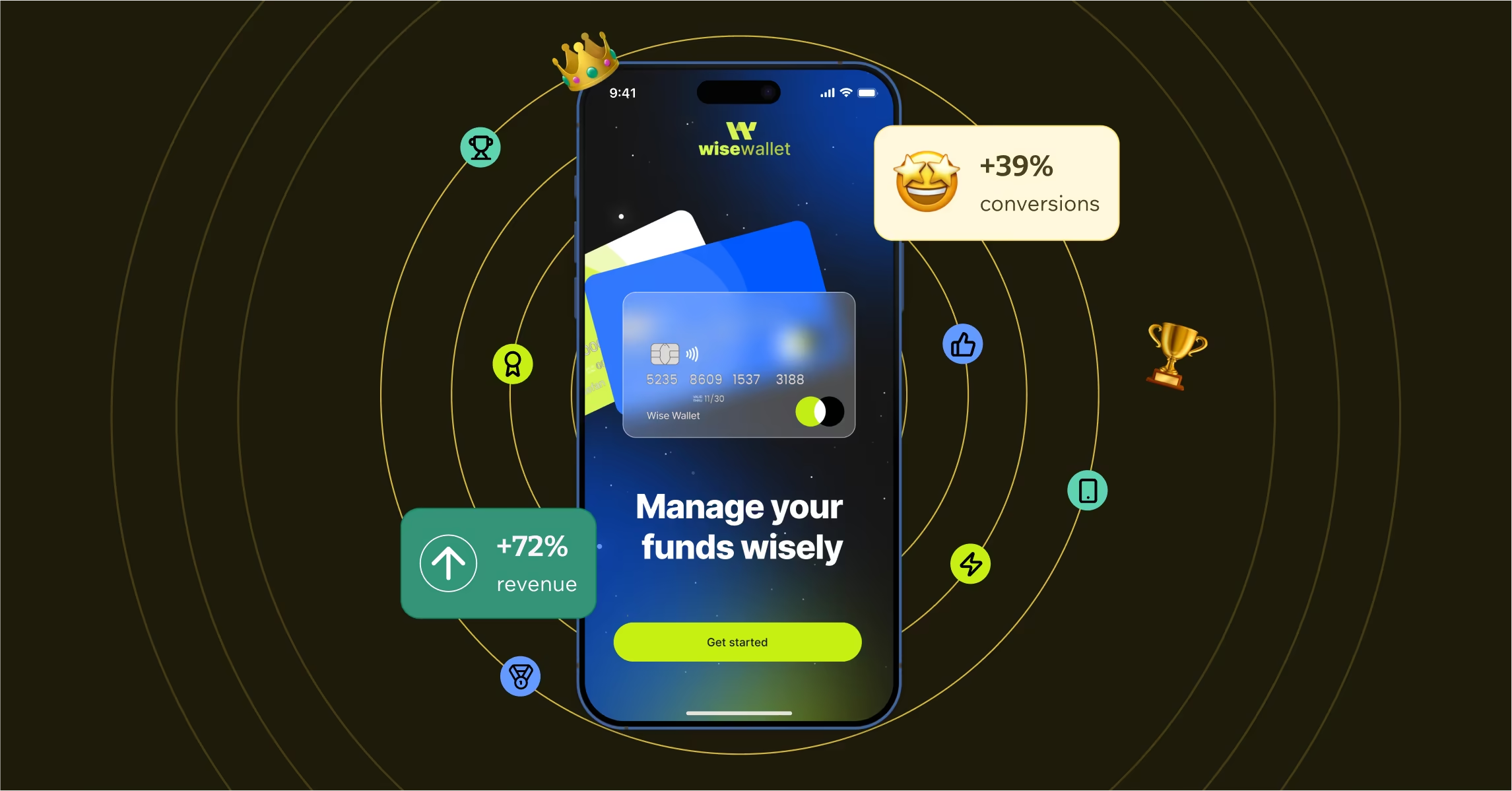
The Business Impact of Mobile-First Design
Companies that prioritize mobile experience see measurable improvements in key business metrics. Better mobile experiences lead to longer session durations, higher conversion rates, and improved customer satisfaction scores.
Search engines also prioritize mobile-friendly sites in search results. Google’s mobile-first indexing means your mobile experience directly impacts your search visibility.
Your mobile experience isn’t just about serving mobile users. It’s about serving all users better by focusing on speed, clarity, and essential functionality. When you design for mobile first, you create better experiences across all devices.